Mini project 1: Rats of New York
Due by 11:59 PM on Friday, October 26, 2018
New York City is full of urban wildlife, and rats are one of the city’s most infamous animal mascots. Rats in NYC are plentiful, but they also deliver food, so they’re useful too.
NYC keeps incredibly detailed data regarding animal sightings, including rats, and it makes this data publicly available.
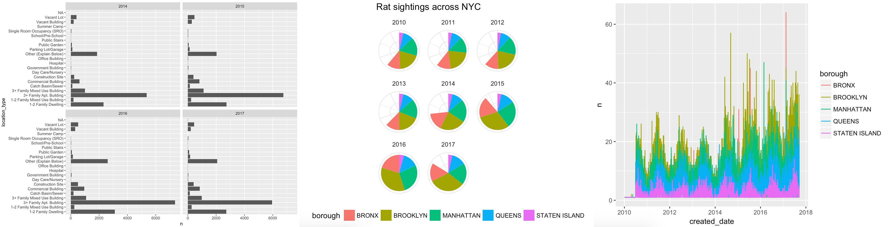
For this first mini project, you will use R and ggplot to tell an interesting story hidden in the data. You can recreate one of these ugly, less-than-helpful graphs, or create a new story by looking at other variables in the data:
Here’s what you need to do:
Create a new RStudio project and place it on your computer somewhere. Open that new folder in Windows File Explorer or macOS Finder (however you navigate around the files on your computer), and create two subfolders there named
dataandoutput.Download New York City’s database of rat sightings since 2010:

Place this in the
datasubfolder you created in step 1.As always, you’ll probably need to right click on this link and choose “Save link as…”, since your browser will want to display it as text. The data was originally uploaded by the City of New York to Kaggle, and is provided with a public domain license.
Create a new R Markdown file and save it in your project. In RStudio go to File > New File > R Markdown…, choose the default options, and delete all the placeholder text in the new file except for the metadata at the top, which is between
---and---.Verify that your project folder is structured like this:
your-project-name/
  your-analysis.Rmd
  your-project-name.Rproj
  data/
    Rat_Sightings.csv
  output/
    NOTHING
Summarize the data somehow. The raw data has more than 100,000 rows, which means you’ll need to aggregate the data. Consider looking at the number of sightings per borough, per year, per dwelling type, etc., or a combination of these, like the change in the number sightings across the 5 boroughs between 2010 and 2016.
Create an appropriate visualization based on the data you summarized.
- Write a memo (no word limit) explaining your process. I’m specifically looking for a discussion of the following:
- What was wrong with the original graphic (if you’re fixing one of the original figures)?
- What story are you telling with your new graphic?
- How did you apply the principles of CRAP?
- How did you apply Alberto Cairo’s five qualities of great visualizations?
- Upload the following outputs to Learning Suite:
- A PDF or Word file of your memo with your final code and graphic embedded in it.You can approach this in a couple different ways—you can write the memo and then include the full figure and code at the end, similar to this blog post, or you can write the memo in an incremental way, describing the different steps of creating the figure, ultimately arriving at a clean final figure, like this blog post.
This means you’ll need to do all your coding in an R Markdown file and embed your code in chunks. - A standalone PNG version of your graphicUse
ggsave(plot_name, filename = "output/blah.png", width = XX, height = XX)
- A standalone PDF version of your graphicUse
ggsave(plot_name, filename = "output/blah.pdf", width = XX, height = XX)
- A PDF or Word file of your memo with your final code and graphic embedded in it.You can approach this in a couple different ways—you can write the memo and then include the full figure and code at the end, similar to this blog post, or you can write the memo in an incremental way, describing the different steps of creating the figure, ultimately arriving at a clean final figure, like this blog post.
You will be graded based on how you use R and ggplot, how well you apply the principles of CRAP, The Truthful Art, and Effective Data Visualization, and how appropriate the graph is for the data and the story you’re telling. I will use this rubric to grade the final product. 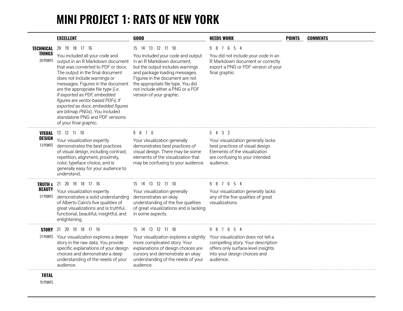
For this assignment, I am less concerned with detailed graphic design principles—select appropriate colors, change fonts if you’re brave, and choose a nice ggplot theme and perhaps make a few adjustments like moving the legend around (theme(legend.position = "bottom")) or other things you find with ggThemeAssist.
The assignment is due by 11:59 PM on Friday, October 26.
Please seek out help when you need it! You know enough R (and have enough examples of code from class and your readings) to be able to do this. Your project has to be turned in individually, and your visualization should be your own (i.e. if you work with others, don’t all turn in the same graph), but you should work with others! Meet with me for help too—I’m here to help!
You can do this, and you’ll feel like a budding dataviz witch/wizard when you’re done.
I’ve provided some starter code below. A couple comments about it:
- By default,
read_csv()treats cells that are empty or “NA” as missing values. This rat dataset uses “N/A” to mark missing values, so we need to add that as a possible marker of missingness (hencena = c("", "NA", "N/A")) - To make life easier, I’ve renamed some of the key variables you might work with. You can rename others if you want.
- I’ve also created a few date-related variables (
sighting_year,sighting_month,sighting_day, andsighting_weekday). You don’t have to use them, but they’re there if you need them.The functions that create these, likeyear()andwday()are part of thelubridatelibrary.
- The date/time variables are formatted like
04/03/2017 12:00:00 AM, which R is not able to automatically parse as a date when reading the CSV file. You can use themdy_hms()function in thelubridatelibrary to parse dates that are structured as “month-day-year-hour-minute.”There are also a bunch of other iterations of this function, likeymd(),dmy(), etc., for other date formats.
- There’s one row with an unspecified borough, so I filter that out.
library(tidyverse)
library(lubridate)

rats_raw <- read_csv("data/Rat_Sightings.csv", na = c("", "NA", "N/A"))

# If you get an error that says "All formats failed to parse. No formats
# found", it's because the mdy_hms function couldn't parse the date. The date
# variable *should* be in this format: "04/03/2017 12:00:00 AM", but in some
# rare instances, it might load without the seconds as "04/03/2017 12:00 AM".
# If there are no seconds, use mdy_hm() instead of mdy_hms().
rats_clean <- rats_raw %>%
  rename(created_date = `Created Date`,
         location_type = `Location Type`,
         borough = Borough) %>%
  mutate(created_date = mdy_hms(created_date)) %>%
  mutate(sighting_year = year(created_date),
         sighting_month = month(created_date),
         sighting_day = day(created_date),
         sighting_weekday = wday(created_date, label = TRUE, abbr = FALSE)) %>%
  filter(borough != "Unspecified")
You’ll summarize the data with functions from dplyr, including stuff like count(), arrange(), filter(), group_by(), summarize(), and mutate(). Here are some examples of ways to summarize the data:
# See the count of rat sightings by weekday
rats_clean %>%
  count(sighting_weekday)

# Assign a table to an object to use it in a plot
rats_by_weekday <- rats_clean %>%
  count(sighting_weekday, sighting_year)

ggplot(rats_by_weekday, aes(x = fct_rev(sighting_weekday), y = n)) +
  geom_col() +
  coord_flip() +
  facet_wrap(~ sighting_year)

# See the count of rat sightings by weekday and borough
rats_clean %>%
  count(sighting_weekday, borough, sighting_year)

# An alternative to count() is to specify the groups with group_by() and then
# be explicit about how you're summarizing the groups, such as calculating the
# mean, standard deviation, or number of observations (we do that here with
# `n()`).
rats_clean %>%
  group_by(sighting_weekday, borough) %>%
  summarize(n = n())