Proportions
Materials for class on Tuesday, October 2, 2018
Contents
Slides
Download the slides from today’s lecture.

Using custom fonts in ggplot
Using your own fonts in ggplot is relatively easy once you set up a couple things. Follow the instructions here for either macOS or Windows.
Live code
Use this link to see the code that I’m actually typing:
I’ve saved the R script to Dropbox, and that link goes to a live version of that file. Refresh or re-open the link as needed to copy/paste code I type up on the screen.
Code from today
Here’s the code that was in the live code script, but that I moved here to be more permanent.
Massive coefficient plot
To show that group_by() can do more powerful things than just calculating group means, here’s how you can run 142 linear regression models simultaneously and plot the results from one of the coefficients.
Here, we explain variation in life expectancy with the log GDP per capita, using data from the Gapminder Project. We fit the following simple linear regression model for each country in the dataset:
\[ \text{lifeExp}_{\text{country}} = \beta_0 + \beta_1 \log( \text{gdpPercap}_{\text{country}}) + \epsilon \]
library(tidyverse)
library(gapminder)
library(broom)

# Create a table of all the countries in the dataset and their continents
gapminder_continents <- gapminder %>%
  distinct(country, continent)

# DO SOME MAGIC
gapminder_models <- gapminder %>%
  group_by(country) %>%
  # Put all the columns for each country in a cell (MAGIC)
  nest() %>%
  # Run the same regression model on each country group
  mutate(model = data %>% map(~ lm(lifeExp ~ log(gdpPercap), data = .))) %>%
  # Extract the model coefficients
  mutate(coefs = model %>% map(~ tidy(., conf.int = TRUE))) %>%
  unnest(coefs) %>%
  # Only look at the term for GDP per capita
  filter(str_detect(term, "gdpPercap")) %>%
  # Make an indicator variable for statistical significance
  mutate(significant = ifelse(p.value < 0.05, TRUE, FALSE)) %>%
  # Bring continents back in
  left_join(gapminder_continents, by = "country") %>%
  # Sort the countries
  arrange(desc(estimate)) %>%
  mutate(country = fct_inorder(country))

# The gapminder_models data frame now contains the beta1 coefficient for each
# country-based model that we ran. We can plot these with geom_pointrange()ggplot(gapminder_models) +
geom_hline(yintercept = 0, color = "darkred") +
geom_pointrange(aes(x = country, y = estimate,
ymin = conf.low, ymax = conf.high,
color = significant)) +
coord_flip() +
facet_wrap(~ continent, scales = "free", ncol = 2) +
theme_light(base_size = 8) +
theme(legend.position = "bottom")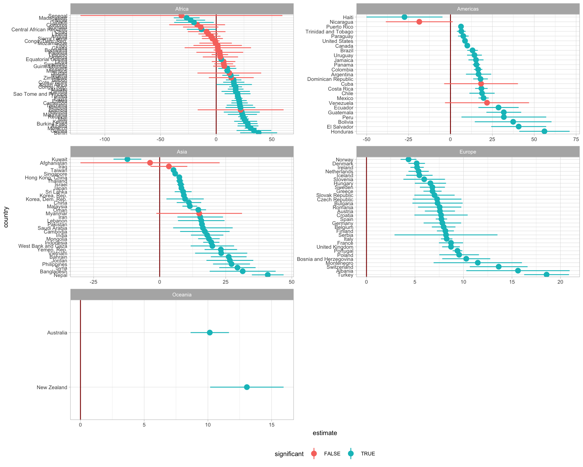
Proportion plots
First we have to load and wrangle the data:
fake_survey <- read_csv("https://andhs.co/fakesurvey")fake_survey <- read_csv(here::here("static", "data", "fake_survey.csv"))survey_summarized <- fake_survey %>%
count(response) %>%
mutate(response = factor(response,
levels = c("Strongly disagree", "Disagree",
"Neither agree nor disagree",
"Agree", "Strongly agree"),
ordered = TRUE)) %>%
arrange(response) %>%
mutate(prop = n / sum(n))Bar plot
Here’s how to make a bar plot. In this example, I’ve assigned the plot as an object named my_super_cool_plot so that I can use it later on with ggsave()
# Bar plot
my_super_cool_plot <- ggplot(survey_summarized,
                             aes(x = response, y = prop, fill = response)) +
  geom_col() +
  geom_label(aes(label = n), fill = "white") +
  guides(fill = FALSE) +
  labs(x = NULL, y = "Percent", title = "Some really cool title",
       subtitle = "Stuff goes here", caption = "By me; source: my head") +
  scale_fill_manual(values = c("grey13", "blue", "#dc2178", "yellow", "orange")) +
  theme_minimal(base_size = 11, base_family = "Papyrus") +
  theme(panel.grid.major.x = element_blank(),
        panel.grid.minor.y = element_blank(),
        plot.title = element_text(family = "Comic Sans MS"))
my_super_cool_plot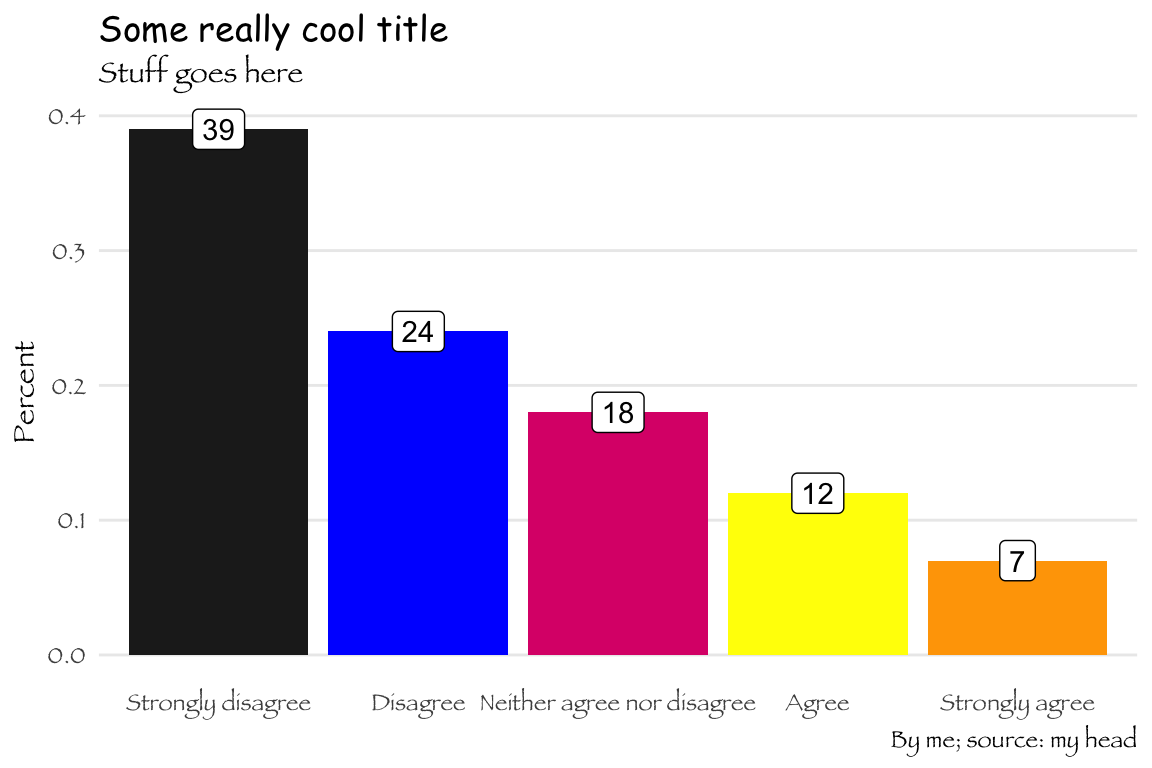
Saving ggplot plots
We can use ggsave() to save plots:
ggsave("plot.pdf", my_super_cool_plot,
       width = 6, height = 3, units = "in")
ggsave("plot.png", my_super_cool_plot,
       width = 6, height = 3, units = "in")
Pie chart
Here we condense the responses into a single stacked bar (this is generally a bad idea, but it’s essentially a straightened out pie chart)
ggplot(survey_summarized, aes(x = "", y = prop, fill = response)) +
  geom_col() +
  theme_void()
If we add coord_polar() to it, it’ll turn into a pie (you need to set the theta to “y”):
ggplot(survey_summarized, aes(x = "", y = prop, fill = response)) +
  geom_col() +
  coord_polar(theta = "y") +
  theme_void()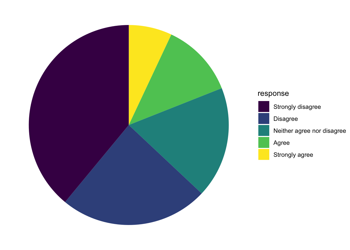
Waffle plots
The waffle() function from the waffle library doesn’t work well with data frames. Instead, you need to feed it a named vector of numbers.
library(waffle)  # https://github.com/hrbrmstr/waffle

# Extract just the counts
data_for_waffle <- survey_summarized$n

# Add response names to the counts
names(data_for_waffle) <- survey_summarized$response

# Plot!
waffle(data_for_waffle, rows = 5, size = 1,
       colors = c("red", "yellow", "blue", "orange", "green"),
       xlab = "1 square = 1 response")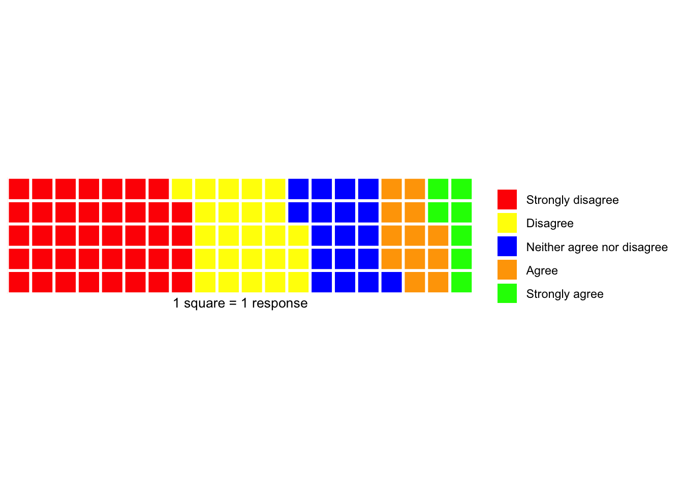
Treemaps
Treemaps, on the other hand (at least the ones made with the treemapify library), do work well with data frames, so you can keep using the same survey_summarized data:
library(treemapify)  # https://github.com/wilkox/treemapify
ggplot(survey_summarized, aes(area = n, fill = response)) +
  geom_treemap() +
  guides(fill = FALSE) +
  geom_treemap_text(aes(label = response),
                    colour = "white", place = "center", grow = TRUE)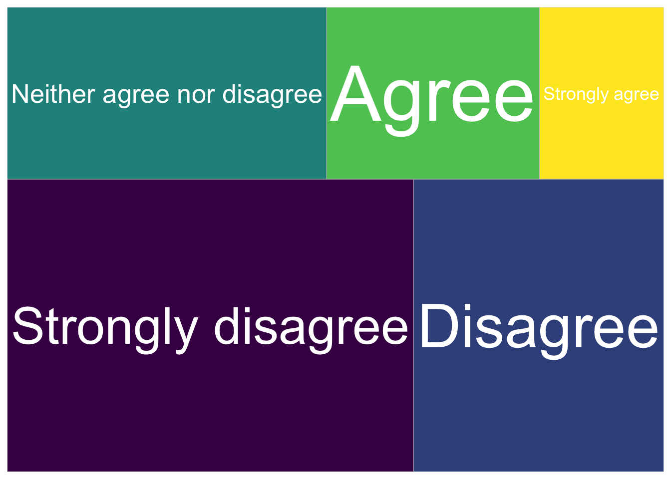
Parliaments
Parliament graphs are incredibly easy to make with ggparliament, and their website has a ton of examples.
library(ggparliament)  # https://github.com/RobWHickman/ggparliament

us_house <- election_data %>%
  filter(country == "USA" &
           year == 2016 &
           house == "Representatives")

# Make the data long and figure out all the x/y coordinates
plot_house <- parliament_data(election_data = us_house,
                              type = "semicircle",
                              parl_rows = 10,
                              party_seats = us_house$seats)

ggplot(plot_house, aes(x, y, color = party_short)) +
  # Add the actual seats
  geom_parliament_seats() +
  # Highlight the party in power with a black line
  geom_highlight_government(government == TRUE) +
  # Add majority threshold
  draw_majoritythreshold(n = 218, label = TRUE, type = "semicircle") +
  # Use theme_ggparliament
  theme_ggparliament() +
  # Maintain proportions
  coord_equal() +
  #other aesthetics
  labs(colour = NULL,
       title = "United States House of Representatives",
       subtitle = "Party that controls the House highlighted.") +
  scale_colour_manual(values = rev(us_house$colour))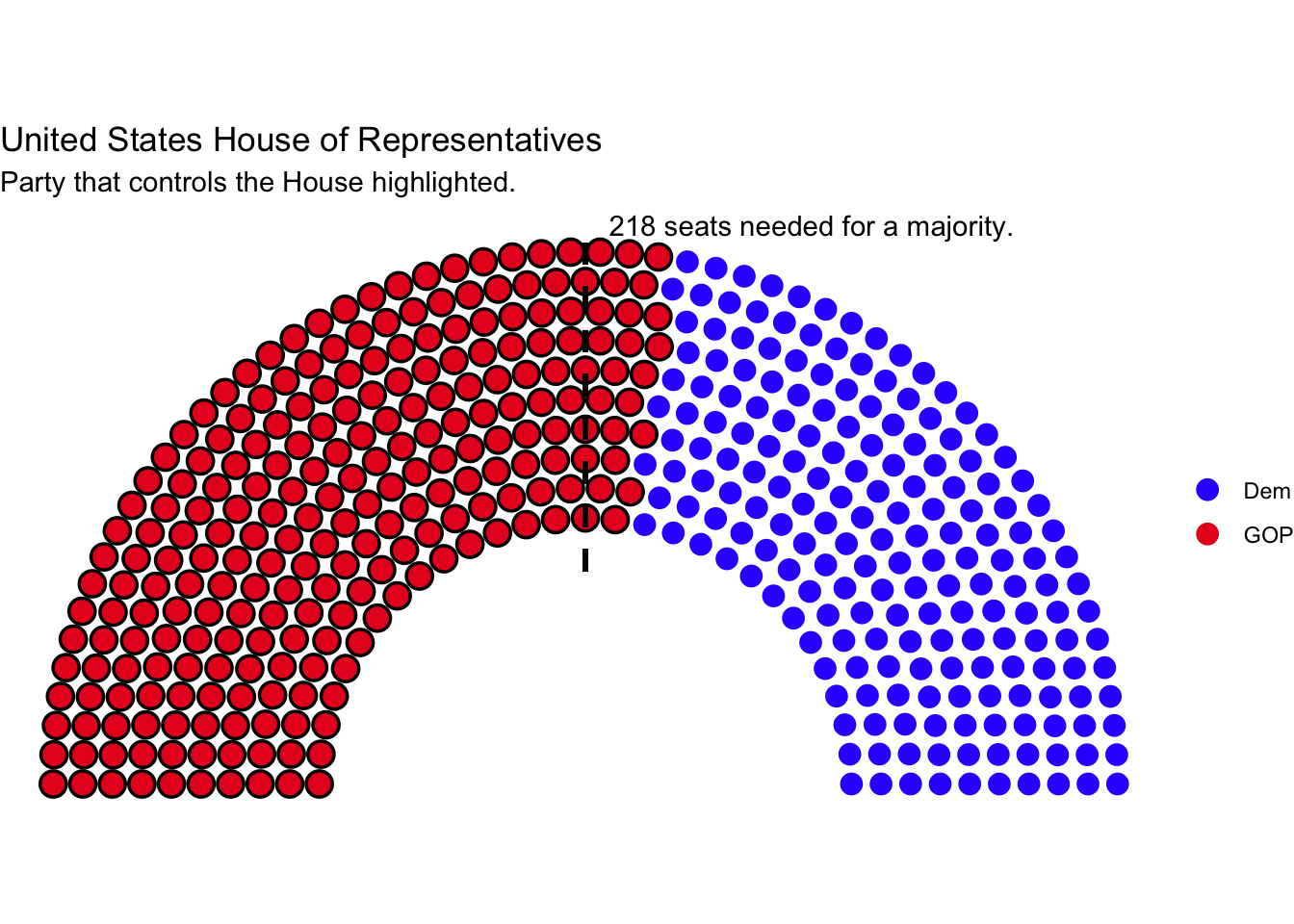
Pyramids and beaches
Finally, here’s some code to generate the joke graphs. Notice the use of tribble(), which lets you manually type out and create a data frame.
pyramid_picture <- tribble(
  ~slice, ~angle,
  "Sky", 280,
  "Sunny side of pyramid", 60,
  "Shady side of pyramid", 20
) %>%
  mutate(slice = fct_inorder(slice),
         angle = angle / 360)

ggplot(pyramid_picture, aes(x = "", y = angle, fill = slice)) +
  geom_col() +
  scale_fill_manual(values = c("#1C94D2", "#F4E734", "#C5B731"),
                    name = NULL) +
  # I got pi/1.3 by trial and error :)
  coord_polar(theta = "y", start = pi / 1.3) +
  theme_void()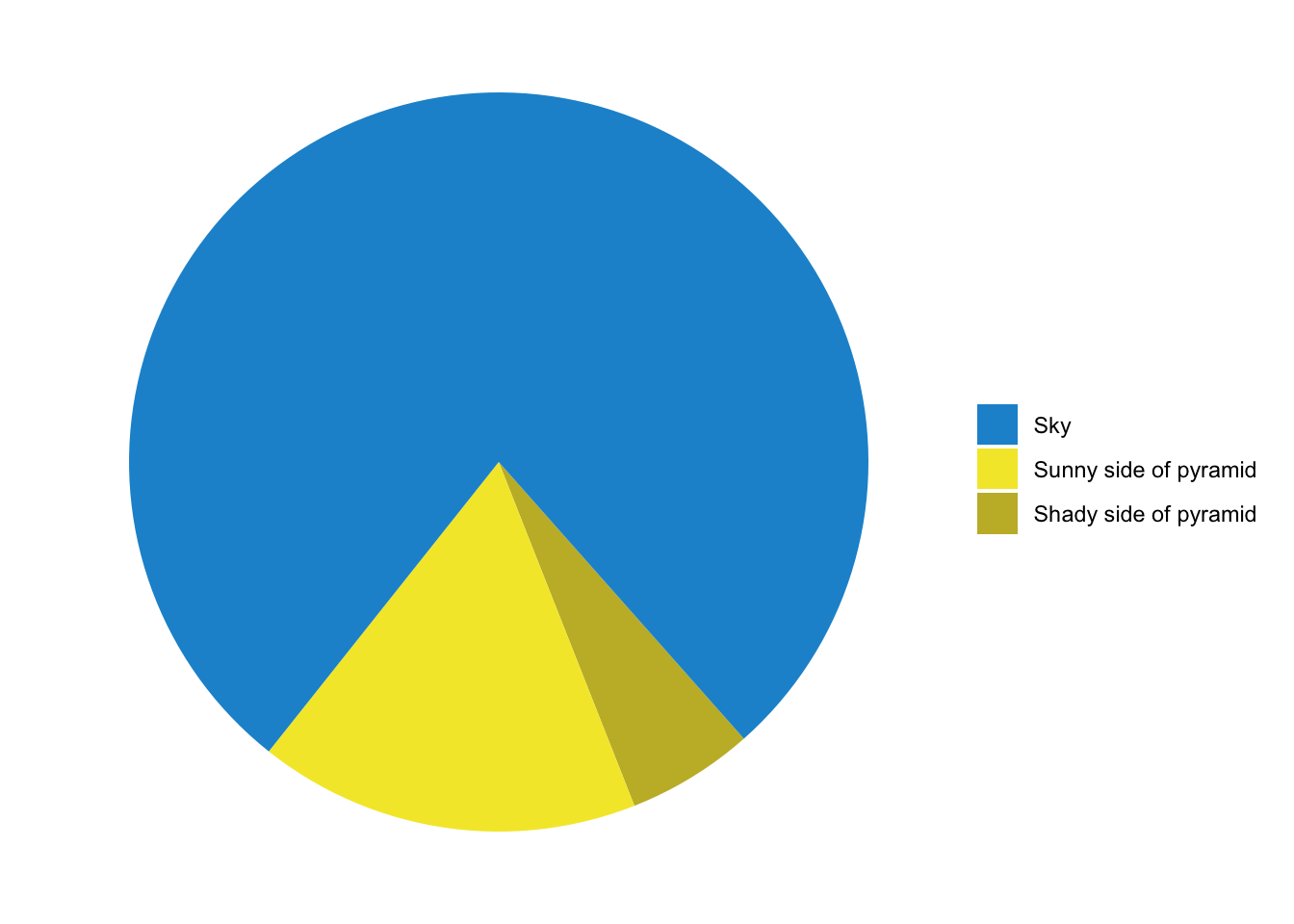
beach_picture <- tribble(
  ~slice, ~angle,
  "Sky", 160,
  "Mountains", 20,
  "Grass", 25,
  "Road", 50,
  "Sidewalk", 20,
  "Beach", 60,
  "Ocean", 25
) %>%
  mutate(slice = fct_inorder(slice),
         angle = angle / 360)

ggplot(beach_picture, aes(x = "", y = angle, fill = slice)) +
  geom_bar(width = 1, stat = "identity") +
  scale_fill_manual(values = c("#7292CB", "#168A46", "#22B34A",
                               "grey20", "grey80", "#FFCE05", "#3E69B2"),
                    name = NULL) +
  # start rotates the plot by 90 degrees; direction makes it go counterclockwise
  coord_polar(theta = "y", start = pi / 2, direction = -1) +
  theme_void()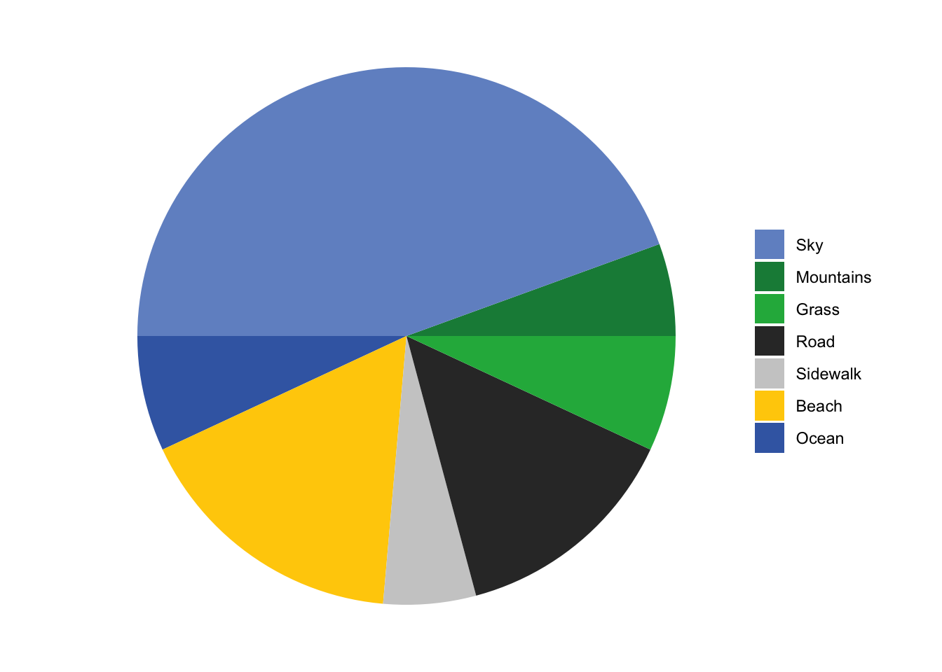
Clearest and muddiest things
Go to this form and answer these two questions:
- What was the muddiest thing from class today? What are you still wondering about?
- What was the clearest thing from class today? What was the most exciting thing you learned?
I’ll compile the questions and send out answers after class.