Uncertainty
Materials for class on Tuesday, October 9, 2018
Contents
Slides
Download the slides from today’s lecture.

Live code
Use this link to see the code that I’m actually typing:
I’ve saved the R script to Dropbox, and that link goes to a live version of that file. Refresh or re-open the link as needed to copy/paste code I type up on the screen.
Code from today
In class we looked at the uncertainty in weather patterns in Provo (specifically 40.248752, -111.649216) for 2017.
First, we load the libraries we’ll be using:
library(tidyverse)
library(lubridate)
library(ggridges)
library(scales)

# Make the randomness reproducible
set.seed(1234)
Then we load the data. I used the darksky R package to download this historical data from Dark Sky, and then I saved the CSV file online.
weather_provo_raw <- read_csv("https://andhs.co/provoweather")Then we wrangle the data, or make adjustments to it so that it’s easier to use and plot. Here we extract the month and weekday of each row as new columns:
# Wrangle data
weather_provo_2017 <- weather_provo_raw %>%
  mutate(Month = month(date, label = TRUE, abbr = FALSE),
         Day = wday(date, label = TRUE, abbr = FALSE))
Now we can do stuff with it!
Histograms
With histograms, you don’t need to specify the y aesthetic, since ggplot will calculate the frequency for you.
ggplot(weather_provo_2017, aes(x = windSpeed)) +
  geom_histogram(binwidth = 1)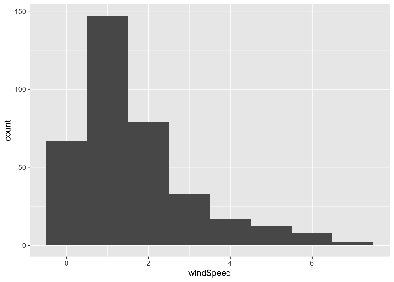
We can look at monthly histograms by using fill, but this is horrendous:
ggplot(weather_provo_2017, aes(x = windSpeed, fill = Month)) +
  geom_histogram(binwidth = 1)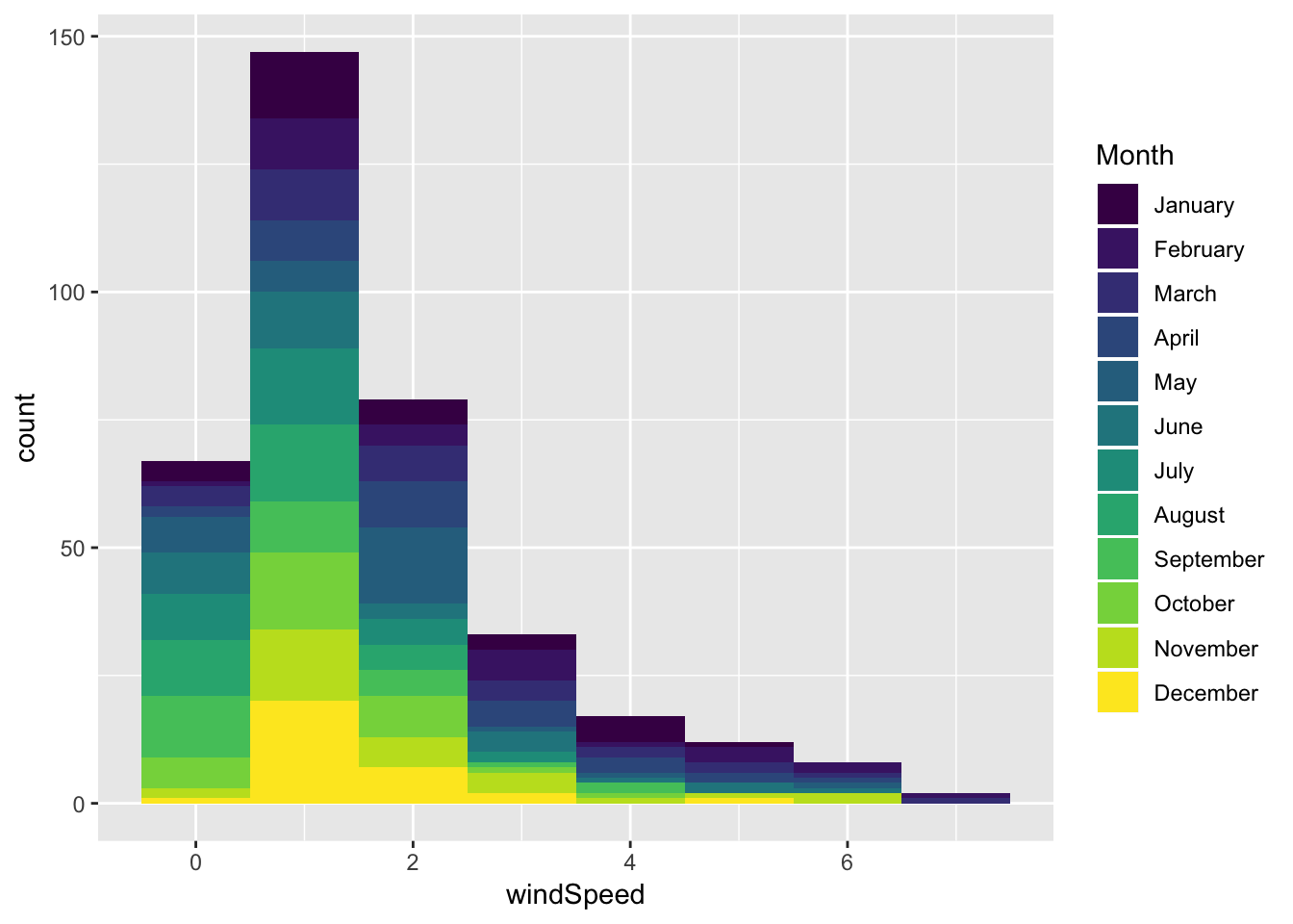
You can also facet, which is probably better (here I turn off the fill legend, since there’s no reason to keep it—it’s obvious which color goes to which month)
ggplot(weather_provo_2017, aes(x = windSpeed, fill = Month)) +
  geom_histogram(binwidth = 1) +
  guides(fill = FALSE) +
  facet_wrap(~ Month)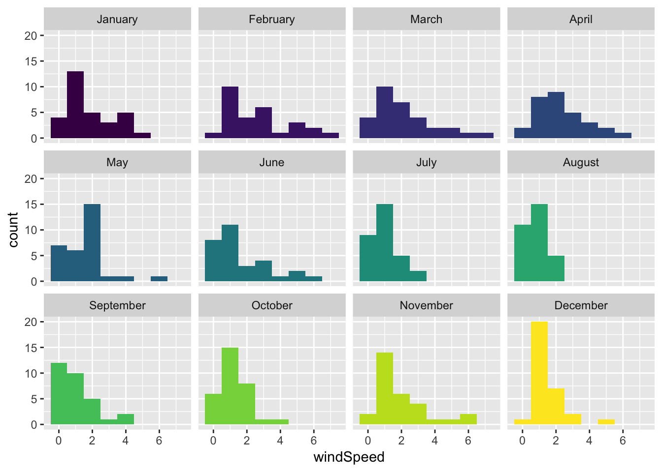
Density plots
Density plots use the same syntax as histograms (i.e. you don’t need to specify a y aesthetic):
ggplot(weather_provo_2017, aes(x = windSpeed)) +
  geom_density(fill = "#24af53")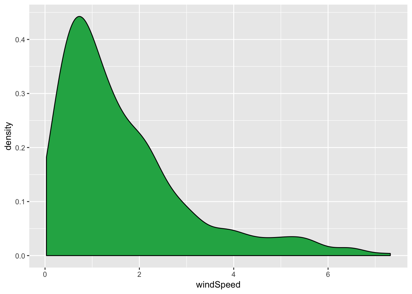
We can also incorporate months into density plots, with facets…
ggplot(weather_provo_2017, aes(x = windSpeed, fill = Month)) +
  geom_density() +
  guides(fill = FALSE) +
  facet_wrap(~ Month)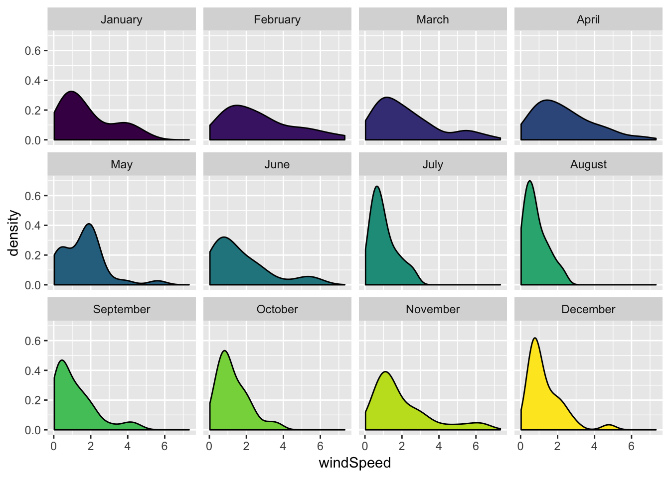
… or by plotting each density curve on top of the other and adding transparency (here I move the legend to the bottom of the plot):
ggplot(weather_provo_2017, aes(x = windSpeed, fill = Month)) +
  geom_density(alpha = 0.4) +
  theme(legend.position = "bottom")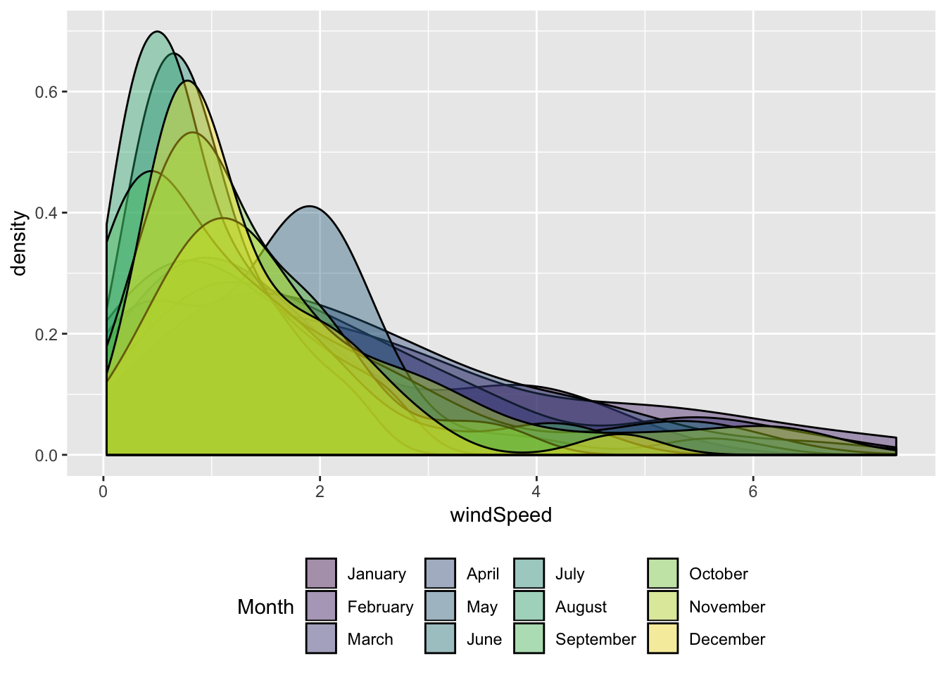
Box plots
We can also make box plots. These are plotted vertically, so you need to put the numeric variable you’re interested in along the y-axis:
ggplot(weather_provo_2017, aes(y = windSpeed)) +
  geom_boxplot()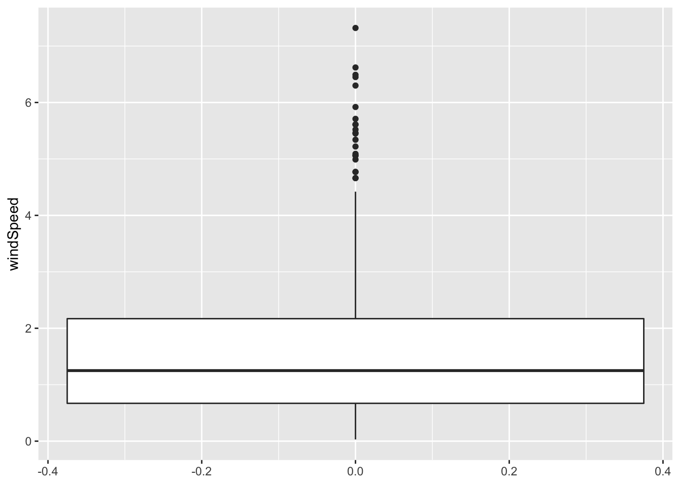
You can also fill or facet or whatever, just like before. Here I use day of the week instead of month, just for fun:
ggplot(weather_provo_2017, aes(y = windSpeed, x = Day, fill = Day)) +
  geom_boxplot() +
  guides(fill = FALSE)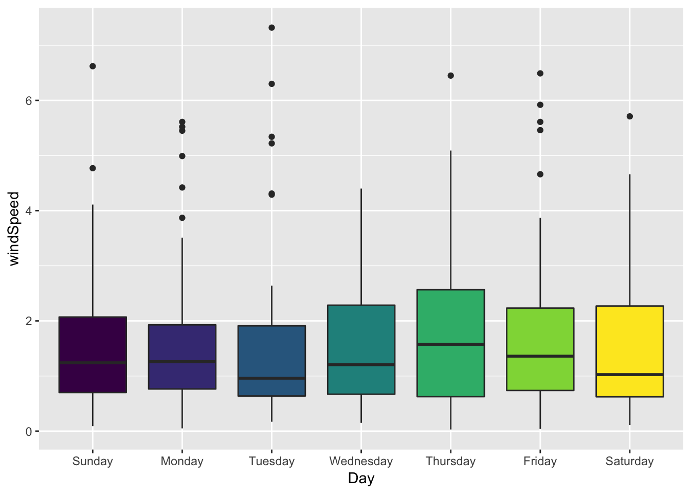
Violin plots
Violin plots use the same syntax as box plots, with the numeric variable on the y-axis. You can use all the other aesthetics too, just like density plots and box plots.
ggplot(weather_provo_2017, aes(y = windSpeed, x = Day, fill = Day)) +
  geom_violin() +
  guides(fill = FALSE)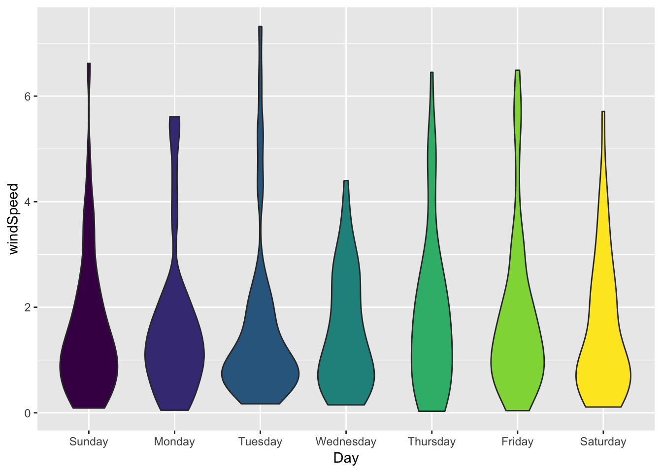
With violin plots, it’s often helpful to add additional geoms, like points:
ggplot(weather_provo_2017, aes(y = windSpeed, x = Day, fill = Day)) +
  geom_violin() +
  geom_point(size = 0.5, position = position_jitter(width = 0.1)) +
  guides(fill = FALSE)
Ridge plots
The ggridges package has a ton of options for plotting stacked density plots. The documentation in R itself is somewhat sparse, but the package’s main webpage has many examples of how to use the different geoms.
Here’s the density of windspeed by month (scale = x adjusts how much the density plots overlap; fct_rev() reverses the month variable so that January goes on top):
ggplot(weather_provo_2017, aes(x = windSpeed, y = fct_rev(Month),
                               fill = Month)) +
  geom_density_ridges(scale = 5) +
  guides(fill = FALSE) +
  labs(x = "Wind speed", y = NULL) +
  theme_minimal()
## Picking joint bandwidth of 0.52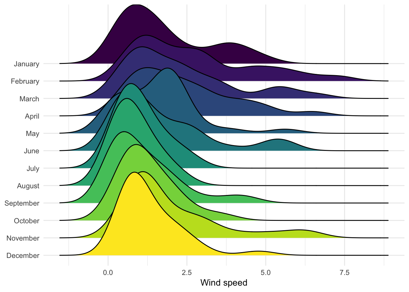
Here’s temperature over time. You can add quantile lines with quantile_lines. Specifying 2 quantiles will split each density in half (giving you the median):
ggplot(weather_provo_2017, aes(x = temperatureHigh, y = fct_rev(Month),
                               fill = Month)) +
  geom_density_ridges(scale = 5, quantile_lines = TRUE, quantiles = 2) +
  guides(fill = FALSE) +
  labs(x = "Daily high temperature", y = NULL) +
  theme_minimal()
## Picking joint bandwidth of 3.48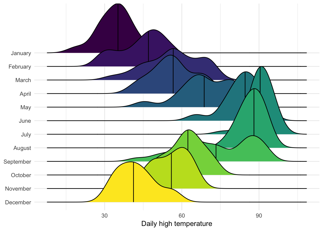
We can also fill each density with a gradient to look extra cool. The ..x.. thing in the fill aesthetic is just how geom_density_ridges_gradient() works. The only way you’d know that (and the only way I knew that) was to look at the example page.
ggplot(weather_provo_2017, aes(x = temperatureHigh, y = Month, fill = ..x..)) +
  geom_density_ridges_gradient(quantile_lines = TRUE, quantiles = 2) +
  scale_fill_viridis_c(option = "plasma", name = "Temp")
## Picking joint bandwidth of 3.48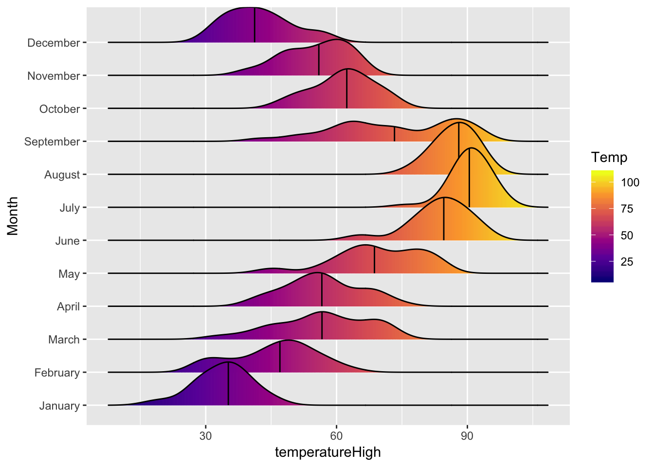
We can plot the high and low temperatures at the same time if we manipulate the data a little. Here we use gather() to take the temperatureLow and temperatureHigh columns and rearrange them so that there’s a column for the actual temperature and a column indicating if it’s high or low
weather_provo_2017_plot <- weather_provo_2017 %>%
  gather(temperature_type, temperature, temperatureLow, temperatureHigh) %>%
  mutate(temperature_type = recode(temperature_type,
                                   temperatureHigh = "High",
                                   temperatureLow = "Low"))

# Print out the first few rows
weather_provo_2017_plot %>%
  select(date, temperature_type, temperature) %>%
  head()
## # A tibble: 6 x 3
## date temperature_type temperature
## <dttm> <chr> <dbl>
## 1 2017-01-01 12:00:00 Low 25.0
## 2 2017-01-02 12:00:00 Low 24.1
## 3 2017-01-03 12:00:00 Low 31.0
## 4 2017-01-04 12:00:00 Low 19.1
## 5 2017-01-05 12:00:00 Low 3.5
## 6 2017-01-06 12:00:00 Low 9.02With the data in this format we can plot both high and low at the same time and show them differently with linetype, which will change the border around each density. There are a bunch of other adjustments here to make the plot more CRAPy.
ggplot(weather_provo_2017_plot,
       aes(x = temperature, y = fct_rev(Month), fill = ..x.., linetype = temperature_type)) +
  geom_density_ridges_gradient(scale = 3, rel_min_height = 0.01) +
  scale_fill_viridis_c(option = "plasma") +
  guides(linetype = guide_legend(title = NULL),
         fill = guide_colorbar(title = NULL)) +
  labs(x = NULL, y = NULL,
       title = "Low and high temperatures in Provo, Utah",
       subtitle = "January 1, 2017-December 31, 2017",
       caption = "Source: Dark Sky") +
  theme_minimal(base_family = "Roboto Condensed") +
  theme(legend.position = "bottom",
        legend.key.width = unit(3, "lines"),
        legend.key.height = unit(0.5, "lines"))
## Picking joint bandwidth of 3.2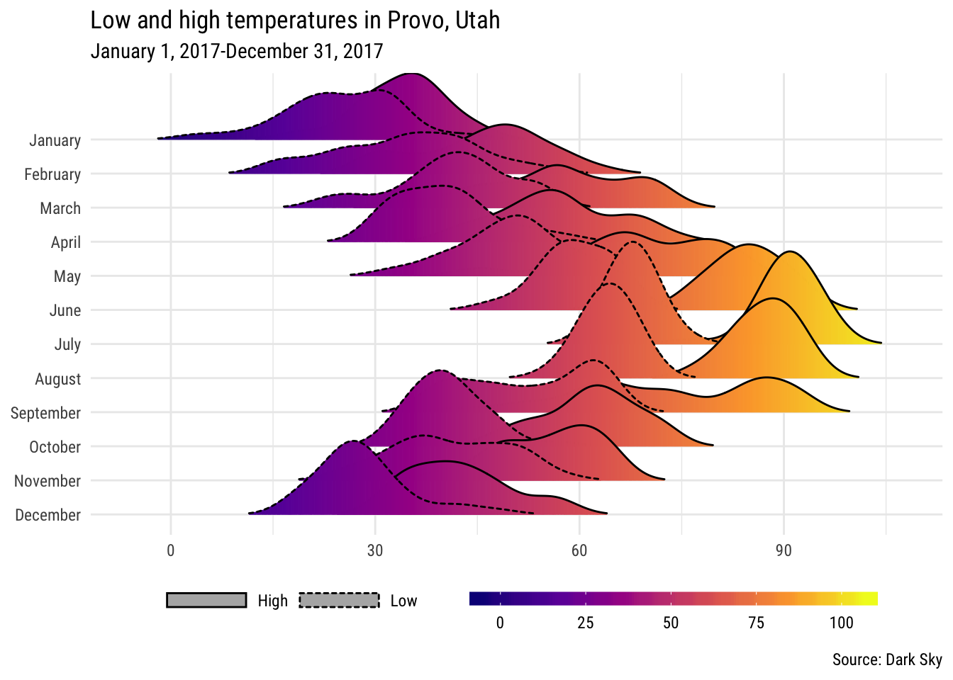
Subjective probabilities
Here’s a full example of another ridgeplot, based on a survey done on Reddit about what each of these subjective probabilities mean in numbers.
probability_raw <- read_csv("https://raw.githubusercontent.com/zonination/perceptions/master/probly.csv")# This data is wide; each column is one of the subjective probabilities.
# Here we make this long.
probability <- probability_raw %>%
gather(phrase, value) %>%
mutate(value = value / 100)
# Here we calculate the media probability for each phrase and put them in order
probability_order <- probability %>%
group_by(phrase) %>%
summarize(median_prob = median(value)) %>%
arrange(median_prob)
# This is the data frame that we'll use to plot. We use the order of the phrases
# from `probability_order` and make the phrase column an ordered factor based on
# that order. Without this, the phrases will plot in alphabetic order
probability_plot <- probability %>%
mutate(phrase = factor(phrase, levels = probability_order$phrase, ordered = TRUE))
ggplot(probability_plot, aes(x = value, y = phrase, fill = phrase)) +
geom_density_ridges(scale = 5, jittered_points = TRUE,
quantile_lines = TRUE, quantiles = 2,
point_size = 0.5, point_alpha = 0.3) +
scale_fill_viridis_d(option = "viridis", guide = FALSE) +
coord_cartesian(xlim = c(0, 1)) +
scale_x_continuous(labels = percent) +
theme_minimal(base_family = "Roboto Condensed")## Picking joint bandwidth of 0.0343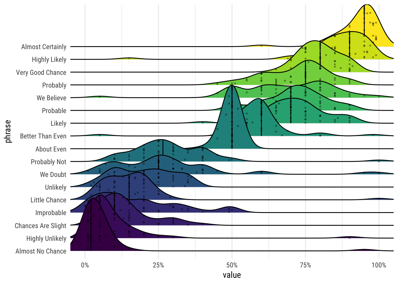
\(•◡•)/
Clearest and muddiest things
Go to this form and answer these two questions:
- What was the muddiest thing from class today? What are you still wondering about?
- What was the clearest thing from class today? What was the most exciting thing you learned?
I’ll compile the questions and send out answers after class.