Relationships
Materials for class on Tuesday, October 16, 2018
Contents
Slides
Download the slides from today’s lecture.

Live code
Use this link to see the code that I’m actually typing:
I’ve saved the R script to Dropbox, and that link goes to a live version of that file. Refresh or re-open the link as needed to copy/paste code I type up on the screen.
Code from today
In class we looked at the some of the relationships in weather characteristics in Provo (specifically 40.248752, -111.649216) for 2017.
First, we load the libraries we’ll be using:
library(tidyverse)
library(lubridate)
library(scales)
Then we load the data. I used the darksky R package to download this historical data from Dark Sky, and then I saved the CSV file online.
weather_provo_raw <- read_csv("https://andhs.co/provoweather")Then we wrangle the data, or make adjustments to it so that it’s easier to use and plot. Here we extract the month and weekday of each row as new columns:
# Wrangle data
weather_provo_2017 <- weather_provo_raw %>%
  mutate(Month = month(date, label = TRUE, abbr = FALSE),
         Day = wday(date, label = TRUE, abbr = FALSE))
Correlation matrix
First we look at the correlation between a bunch of the columns in the weather data, like the probability of precipitation, the high and low temperature, humidity, and wind speed. We use select() to only choose those columns, and then we use cor() to calculate the correlation. Ordinarily, cor() takes two arguments—x and y—and it will return a single correlation number. If you feed a data frame into cor(), though, it will calculate the correlation between each pair of columns, automatically.
# Correlation matrix
things_to_correlate <- weather_provo_2017 %>%
  select(precipProbability, temperatureHigh, temperatureLow, humidity, windSpeed) %>%
  cor()
things_to_correlate
## precipProbability temperatureHigh temperatureLow
## precipProbability 1.00000000 -0.3348888 -0.3055170
## temperatureHigh -0.33488883 1.0000000 0.9535732
## temperatureLow -0.30551699 0.9535732 1.0000000
## humidity 0.63379855 -0.7788007 -0.6943848
## windSpeed 0.08114967 -0.1533819 -0.1302794
## humidity windSpeed
## precipProbability 0.633798555 0.081149667
## temperatureHigh -0.778800749 -0.153381937
## temperatureLow -0.694384760 -0.130279439
## humidity 1.000000000 -0.006464211
## windSpeed -0.006464211 1.000000000The two halves of this matrix (split along the diagonal line) are identical, so we can remove the lower triangle with this code (which will set all the cells in the lower triangle to NA):
# Get rid of the lower triangle
things_to_correlate[lower.tri(things_to_correlate)] <- NA
things_to_correlate
## precipProbability temperatureHigh temperatureLow
## precipProbability 1 -0.3348888 -0.3055170
## temperatureHigh NA 1.0000000 0.9535732
## temperatureLow NA NA 1.0000000
## humidity NA NA NA
## windSpeed NA NA NA
## humidity windSpeed
## precipProbability 0.6337986 0.081149667
## temperatureHigh -0.7788007 -0.153381937
## temperatureLow -0.6943848 -0.130279439
## humidity 1.0000000 -0.006464211
## windSpeed NA 1.000000000Finally, in order to plot this, the data needs to be in tidy (or long) format. Here we convert the things_to_correlate matrix into a data frame, add a column of the row names, take all the columns and put them into a single column named measure1, and take all the correlation numbers and put them in a column named value. In the end, we make sure the measure variables are ordered by their order of appearance (otherwise they plot alphabetically and don’t make a triangle)
things_to_correlate_long <- things_to_correlate %>%
  as.data.frame() %>%
  rownames_to_column("measure2") %>%
  gather(measure1, value, -measure2) %>%
  mutate(nice_value = round(value, 2)) %>%
  mutate(measure1 = fct_inorder(measure1),
         measure2 = fct_inorder(measure2)) %>%
  filter(!is.na(value))

head(things_to_correlate_long)
## measure2 measure1 value nice_value
## 1 precipProbability precipProbability 1.0000000 1.00
## 2 precipProbability temperatureHigh -0.3348888 -0.33
## 3 temperatureHigh temperatureHigh 1.0000000 1.00
## 4 precipProbability temperatureLow -0.3055170 -0.31
## 5 temperatureHigh temperatureLow 0.9535732 0.95
## 6 temperatureLow temperatureLow 1.0000000 1.00With the data in this shape, we can make a heatmap with geom_tile():
ggplot(things_to_correlate_long, aes(x = measure2, y = measure1, fill = value)) +
  geom_tile() +
  geom_text(aes(label = nice_value)) +
  scale_fill_gradient2(low = "#5e3c99", mid = "white", high = "#e66101",
                       na.value = "grey95", name = "Correlation") +
  labs(x = NULL, y = NULL) +
  theme_minimal() +
  theme(axis.text.x = element_text(angle = 45, hjust = 1))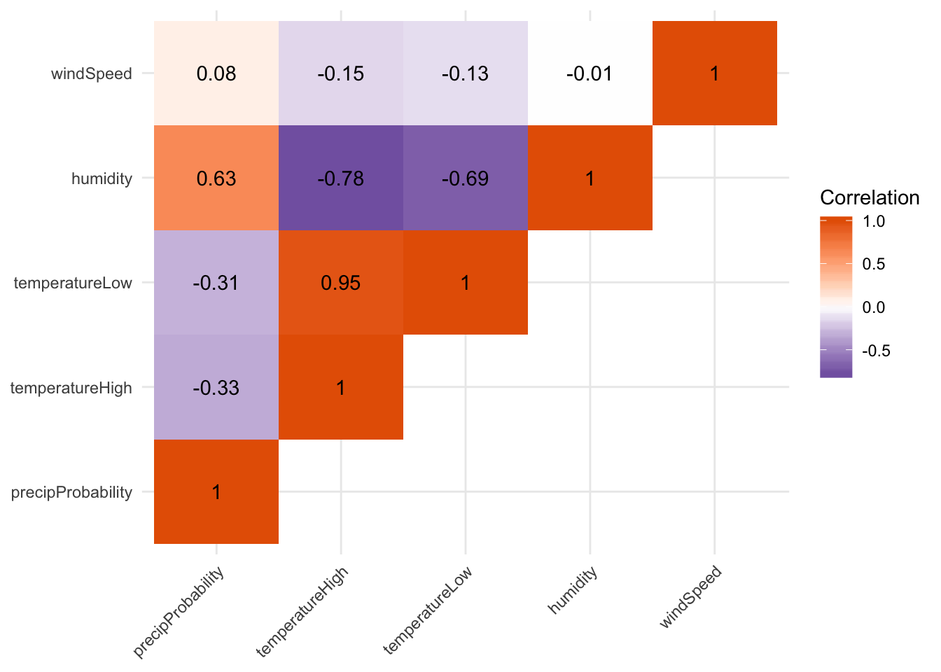
Not surprisingly, high and low temperatures are highly positively correlated, while humidity and the probability of precipitation are highly negatively correlated.
Dual y-axes
Adding a second y-axis is legal as long as the second axis is some mathematical version of the first axis (like count + percent, or fahrenheit + celsius). We can add a second axis with the sec.axis = sec_axis() argument in scale_y_continuous()You can add a second x-axis doing the same thing inside scale_x_continuous()
. The trans argument is a mathemtical formula you use to transform the y values, and the . is a placeholder for y. In this case, ggplot will use the following formula to convert fahrenheit to celsius:
\[ \text{C} = (32 - \text{F}) \times -\frac{5}{9} \]
# Dual y axes
ggplot(weather_provo_2017, aes(x = date, y = temperatureHigh)) +
  geom_line() +
  scale_y_continuous(sec.axis = sec_axis(trans = ~ (32 - .) * -5/9,
                                         name = "Celsius", labels = degree_format()),
                     labels = degree_format()) +
  labs(x = NULL, y = "Fahrenheit") +
  theme_minimal()
Multiple panels
We can use the patchwork library (not yet on CRAN: install from GitHub following the instructions there) to lay out plots in a single plot. It’s magic.
If you save the output of a plot to an object, you can manipulate it later (with ggsave() or ggplotly(), for instance). You can also add it to another plot with patchwork.
First we make two plots, one of temperature and one of humidity:
temp_plot <- ggplot(weather_provo_2017, aes(x = date, y = temperatureHigh)) +
  geom_line() +
  geom_smooth(method = "loess") +
  scale_y_continuous(sec.axis = sec_axis(trans = ~ (32 - .) * -5/9,
                                         name = "Celsius", labels = degree_format()),
                     labels = degree_format()) +
  labs(x = NULL, y = "Fahrenheit") +
  theme_minimal()
temp_plot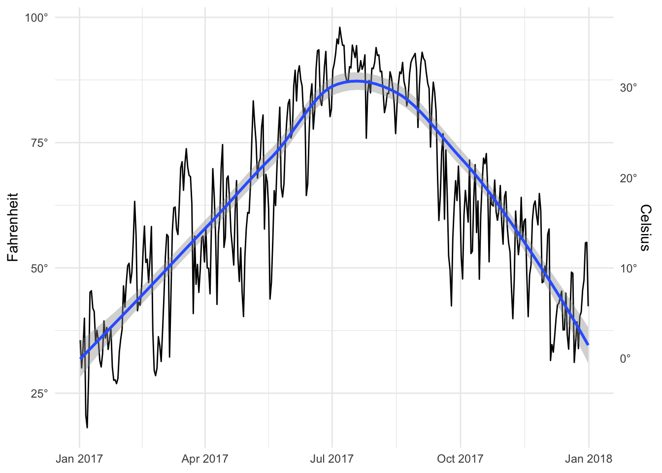
humid_plot <- ggplot(weather_provo_2017, aes(x = date, y = humidity)) +
  geom_line() +
  geom_smooth(method = "loess") +
  scale_y_continuous(labels = percent_format(accuracy = 1)) +
  labs(x = NULL, y = "Humidity") +
  theme_minimal()
humid_plot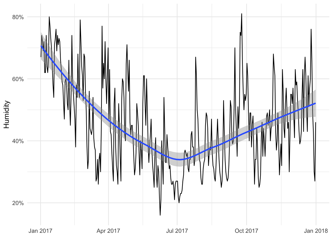
Now we can add them together:
library(patchwork)
temp_plot + humid_plot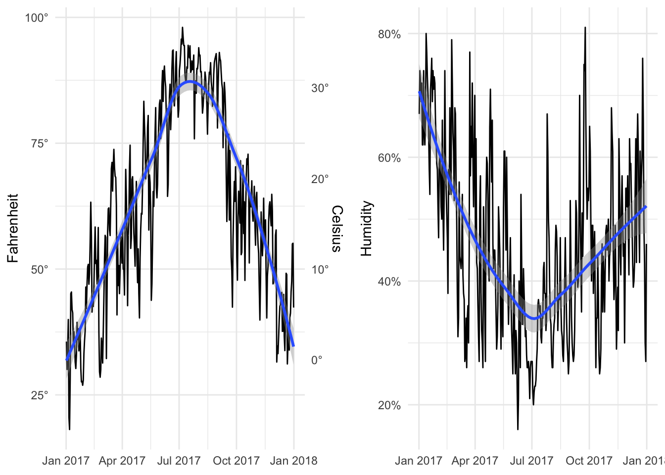
By default it’ll place them side by side in multiple columns in a single row, but we can specify layout options with plot_layout(). Here ncol specifies that the plots will go in a single column, while heights specifies the relative heights for the two plots (70% for the first one, 30% for the second).
temp_plot + humid_plot +
  plot_layout(ncol = 1, heights = c(0.7, 0.3))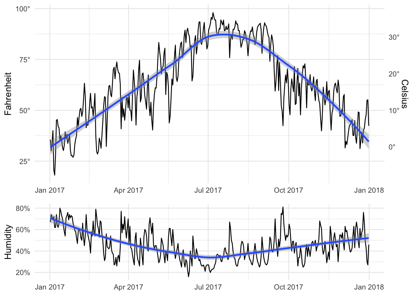
Patchwork comes with a billion other neat plot layout options. See the documentation at GitHub for examples.
Regression models
Finally, we plotted regression output. Here, we explain variation in daily temperature with humidity, the phase of the moon, the probability of precipitation, wind speed, air pressure, and cloud cover.
The first model we run is accurate, but the coefficients are a little hard to interpret. Recall that each slope is interpreted as “a one unit change in X is associated with a <slope of X> change in Y”. The values of humidity, moon phase, and others range from 0 to 1 (i.e. they’re percentages), so a 1 unit change means going from 0 to 1 (or no cloud cover at all to 100% cloud cover). To make these coefficients easier to interpret, we can multiply these columns by 100 (so that 50% cloud coverage is 50 instead of 0.5).
model1 <- lm(temperatureHigh ~ humidity + moonPhase +
               precipProbability + windSpeed + pressure + cloudCover,
             data = weather_provo_2017)
summary(model1)
##
## Call:
## lm(formula = temperatureHigh ~ humidity + moonPhase + precipProbability +
## windSpeed + pressure + cloudCover, data = weather_provo_2017)
##
## Residuals:
## Min 1Q Median 3Q Max
## -24.661 -6.381 0.128 5.827 26.284
##
## Coefficients:
## Estimate Std. Error t value Pr(>|t|)
## (Intercept) 1213.90616 89.06861 13.629 < 2e-16 ***
## humidity -89.91189 6.40497 -14.038 < 2e-16 ***
## moonPhase -0.88652 1.70343 -0.520 0.60308
## precipProbability 13.55872 4.04966 3.348 0.00090 ***
## windSpeed -3.50263 0.40916 -8.561 3.36e-16 ***
## pressure -1.08434 0.08862 -12.236 < 2e-16 ***
## cloudCover -8.59432 3.07491 -2.795 0.00547 **
## ---
## Signif. codes: 0 '***' 0.001 '**' 0.01 '*' 0.05 '.' 0.1 ' ' 1
##
## Residual standard error: 9.228 on 358 degrees of freedom
## Multiple R-squared: 0.7759, Adjusted R-squared: 0.7722
## F-statistic: 206.6 on 6 and 358 DF, p-value: < 2.2e-16We can make these adjustments directly in the formula, but we have to wrap the math with the I() function, otherwise R will think that “100” is the name of a variable.
model2 <- lm(temperatureHigh ~ I(humidity * 100) + I(moonPhase * 100) +
               I(precipProbability * 100) + windSpeed + pressure + I(cloudCover * 100),
             data = weather_provo_2017)
summary(model2)
##
## Call:
## lm(formula = temperatureHigh ~ I(humidity * 100) + I(moonPhase *
## 100) + I(precipProbability * 100) + windSpeed + pressure +
## I(cloudCover * 100), data = weather_provo_2017)
##
## Residuals:
## Min 1Q Median 3Q Max
## -24.661 -6.381 0.128 5.827 26.284
##
## Coefficients:
## Estimate Std. Error t value Pr(>|t|)
## (Intercept) 1213.906163 89.068610 13.629 < 2e-16 ***
## I(humidity * 100) -0.899119 0.064050 -14.038 < 2e-16 ***
## I(moonPhase * 100) -0.008865 0.017034 -0.520 0.60308
## I(precipProbability * 100) 0.135587 0.040497 3.348 0.00090 ***
## windSpeed -3.502630 0.409156 -8.561 3.36e-16 ***
## pressure -1.084336 0.088619 -12.236 < 2e-16 ***
## I(cloudCover * 100) -0.085943 0.030749 -2.795 0.00547 **
## ---
## Signif. codes: 0 '***' 0.001 '**' 0.01 '*' 0.05 '.' 0.1 ' ' 1
##
## Residual standard error: 9.228 on 358 degrees of freedom
## Multiple R-squared: 0.7759, Adjusted R-squared: 0.7722
## F-statistic: 206.6 on 6 and 358 DF, p-value: < 2.2e-16Alternatively, you can adjust the columns in the data frame you’re using (this is what I prefer to do):
weather_provo_2017_fixed <- weather_provo_2017 %>%
  mutate(humidity_scaled = humidity * 100,
         moonPhase_scaled = moonPhase * 100,
         precipProbability_scaled = precipProbability * 100,
         cloudCover_scaled = cloudCover * 100)

model3 <- lm(temperatureHigh ~ humidity_scaled + moonPhase_scaled +
               precipProbability_scaled + windSpeed + pressure + cloudCover_scaled,
             data = weather_provo_2017_fixed)
summary(model3)
##
## Call:
## lm(formula = temperatureHigh ~ humidity_scaled + moonPhase_scaled +
## precipProbability_scaled + windSpeed + pressure + cloudCover_scaled,
## data = weather_provo_2017_fixed)
##
## Residuals:
## Min 1Q Median 3Q Max
## -24.661 -6.381 0.128 5.827 26.284
##
## Coefficients:
## Estimate Std. Error t value Pr(>|t|)
## (Intercept) 1213.906163 89.068610 13.629 < 2e-16 ***
## humidity_scaled -0.899119 0.064050 -14.038 < 2e-16 ***
## moonPhase_scaled -0.008865 0.017034 -0.520 0.60308
## precipProbability_scaled 0.135587 0.040497 3.348 0.00090 ***
## windSpeed -3.502630 0.409156 -8.561 3.36e-16 ***
## pressure -1.084336 0.088619 -12.236 < 2e-16 ***
## cloudCover_scaled -0.085943 0.030749 -2.795 0.00547 **
## ---
## Signif. codes: 0 '***' 0.001 '**' 0.01 '*' 0.05 '.' 0.1 ' ' 1
##
## Residual standard error: 9.228 on 358 degrees of freedom
## Multiple R-squared: 0.7759, Adjusted R-squared: 0.7722
## F-statistic: 206.6 on 6 and 358 DF, p-value: < 2.2e-16We can interpret these coefficients thusly:
- A one percent increase in humidity is associated with a 0.899˚ decrease in a day’s high temperature, on average, controlling for a host of other factors
- A one percent increase in the percent of the moon that is visible is not significantly associated with changes in temperature (surprise!)
- A one percent increase in the probability of precipitation is associated with a 0.136˚ increase in a day’s high temperature, on average, controlling for a bunch of stuff
- A 1 mph increase in wind speed is associated with a 3.5˚ decrease in a day’s high temperature, on average, controlling for stuff
- A 1 unit increase in barometic pressure is associated with a 1.08˚ decrease in a day’s high temperature, on average, controlling for stuff
- A one percent increase in the amount of cloud cover is associated with a 0.09˚ decrease in a day’s high temperature, on average, controlling for stuff
We can show these coefficients visually in a coefficient plot. Right now, the model3 object is not in a nice plottable format. We can use the tidy() function in the broom library to convert model objects into manipulatable and plottable data frames. We then filter out the row for the intercept, because we don’t care about that for this plot (it’s just the baseline temperature when not controlling for any of the explanatory variables we included in the model)
library(broom)

model_tidied <- tidy(model3, conf.int = TRUE) %>%
  filter(term != "(Intercept)")

model_tidied
## # A tibble: 6 x 7
## term estimate std.error statistic p.value conf.low conf.high
## <chr> <dbl> <dbl> <dbl> <dbl> <dbl> <dbl>
## 1 humidity_scaled -0.899 0.0640 -14.0 5.69e-36 -1.03 -0.773
## 2 moonPhase_scal… -0.00887 0.0170 -0.520 6.03e- 1 -0.0424 0.0246
## 3 precipProbabil… 0.136 0.0405 3.35 9.00e- 4 0.0559 0.215
## 4 windSpeed -3.50 0.409 -8.56 3.36e-16 -4.31 -2.70
## 5 pressure -1.08 0.0886 -12.2 5.32e-29 -1.26 -0.910
## 6 cloudCover_sca… -0.0859 0.0307 -2.79 5.47e- 3 -0.146 -0.0255Finally, with this tidy model data, we can plot the coefficients and confidence intervals with geom_pointrange(). We actually use the geom_pointrangeh() function from the ggstance library to plot horizontal point ranges. We could have also used regular vertical point ranges with geom_pointrange() and then added a coord_flip() to rotate the plot, but then you have to remember that x and y are switched and it gets confusing.
library(ggstance)

ggplot(model_tidied, aes(x = estimate, y = term)) +
  geom_vline(xintercept = 0, color = "red", linetype = "dotted") +
  geom_pointrangeh(aes(xmin = conf.low, xmax = conf.high)) +
  labs(x = "Coefficient", y = NULL) +
  theme_minimal()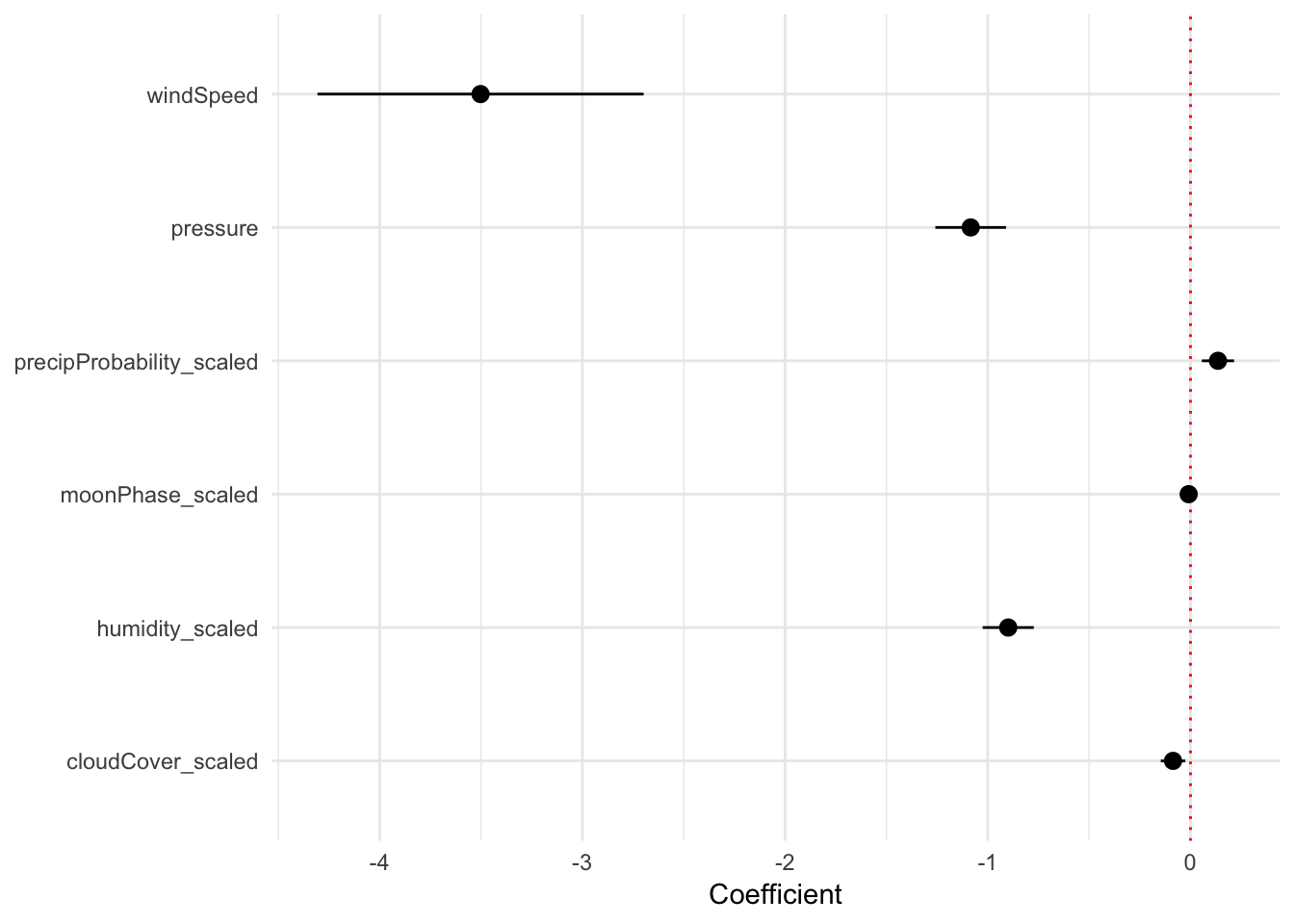
Regression predictions
(We didn’t cover this in class, but this kind of model visualization is incredibly powerful and important and valuable.)
Remember that regression coefficients allow us to build actual mathematical formulas that predict the value of Y. The coefficients from model3 yield the following big hairy ugly equation:
\[ \begin{aligned} \hat{\text{High temperature}} =& 1213.9 - 0.899 \times \text{humidity_scaled } \\ & - 0.009 \times \text{moonPhase_scaled } + 0.136 \times \text{precipProbability_scaled } \\ & - 3.5 \times \text{windSpeed} - 1.08 \times \text{pressure} - 0.086 \times \text{cloudCover_scaled} \end{aligned} \]
If we plug in values for each of the explanatory variables, we can get the predicted value of high temperature, or \(\hat{y}\).
The augment() function in the broom library allows us to take a data frame of explanatory variable values, plug them into the model equation, and get predictions out. For example, let’s set each of the variables to some arbitrary values (50% for humidity, moon phase, chance of rain, and cloud cover; 1000 for pressure, and 1 MPH for wind speed).
newdata_example <- data_frame(humidity_scaled = 50, moonPhase_scaled = 50,
                              precipProbability_scaled = 50, windSpeed = 1,
                              pressure = 1000, cloudCover_scaled = 50)
newdata_example
## # A tibble: 1 x 6
## humidity_scaled moonPhase_scaled precipProbabili… windSpeed pressure
## <dbl> <dbl> <dbl> <dbl> <dbl>
## 1 50 50 50 1 1000
## # ... with 1 more variable: cloudCover_scaled <dbl>We can then plug these values into the model with augment():
# I use select() here because augment() returns columns for all the explanatory
# variables, and the .fitted column with the predicted value is on the far right
# and gets cut off
augment(model3, newdata = newdata_example) %>%
  select(.fitted, .se.fit)
## # A tibble: 1 x 2
## .fitted .se.fit
## * <dbl> <dbl>
## 1 83.2 1.69Given these weather conditions, the predicted high temperature is 83.2˚. Magic!
We can follow the same pattern to show how the predicted temperature changes as specific variables change across a whole range. Here, we create a data frame of possible wind speeds and keep all the other explanatory variables at their means:
newdata <- data_frame(windSpeed = seq(0, 8, 0.5),
                      pressure = mean(weather_provo_2017_fixed$pressure),
                      precipProbability_scaled = mean(weather_provo_2017_fixed$precipProbability_scaled),
                      moonPhase_scaled = mean(weather_provo_2017_fixed$moonPhase_scaled),
                      humidity_scaled = mean(weather_provo_2017_fixed$humidity_scaled),
                      cloudCover_scaled = mean(weather_provo_2017_fixed$cloudCover_scaled))

# Show the first few rows
head(newdata)
## # A tibble: 6 x 6
## windSpeed pressure precipProbabili… moonPhase_scaled humidity_scaled
## <dbl> <dbl> <dbl> <dbl> <dbl>
## 1 0 1016. 10.7 48.8 45.7
## 2 0.5 1016. 10.7 48.8 45.7
## 3 1 1016. 10.7 48.8 45.7
## 4 1.5 1016. 10.7 48.8 45.7
## 5 2 1016. 10.7 48.8 45.7
## 6 2.5 1016. 10.7 48.8 45.7
## # ... with 1 more variable: cloudCover_scaled <dbl>If we feed this big data frame into augment(), we can get the predicted high temperature for each row. We can also use the .se.fit column to calculate the 95% confidence interval for each predicted value. We take the standard error, multiply it by -1.96 and 1.96 (or the quantile of the normal distribution at 2.5% and 97.5%), and add that value to the estimate.
predicted_values <- augment(model3, newdata = newdata) %>%
  mutate(conf.low = .fitted + (-1.96 * .se.fit),
         conf.high = .fitted + (1.96 * .se.fit))

predicted_values %>%
  select(windSpeed, .fitted, .se.fit, conf.low, conf.high)
## # A tibble: 17 x 5
## windSpeed .fitted .se.fit conf.low conf.high
## <dbl> <dbl> <dbl> <dbl> <dbl>
## 1 0 68.9 0.829 67.2 70.5
## 2 0.5 67.1 0.673 65.8 68.4
## 3 1 65.4 0.551 64.3 66.4
## 4 1.5 63.6 0.487 62.6 64.6
## 5 2 61.9 0.504 60.9 62.8
## 6 2.5 60.1 0.596 58.9 61.3
## 7 3 58.3 0.735 56.9 59.8
## 8 3.5 56.6 0.899 54.8 58.4
## 9 4 54.8 1.08 52.7 57.0
## 10 4.5 53.1 1.26 50.6 55.6
## 11 5 51.3 1.45 48.5 54.2
## 12 5.5 49.6 1.65 46.4 52.8
## 13 6 47.8 1.85 44.2 51.5
## 14 6.5 46.1 2.04 42.1 50.1
## 15 7 44.3 2.24 39.9 48.7
## 16 7.5 42.6 2.44 37.8 47.4
## 17 8 40.8 2.64 35.7 46.0Neat! Now we can plot this:
ggplot(predicted_values, aes(x = windSpeed, y = .fitted)) +
  geom_ribbon(aes(ymin = conf.low, ymax = conf.high),
              fill = "grey80", alpha = 0.5) +
  geom_line(size = 1) +
  scale_y_continuous(labels = degree_format()) +
  labs(x = "Wind speed (MPH)", y = "Predicted high temperature (F)") +
  theme_minimal()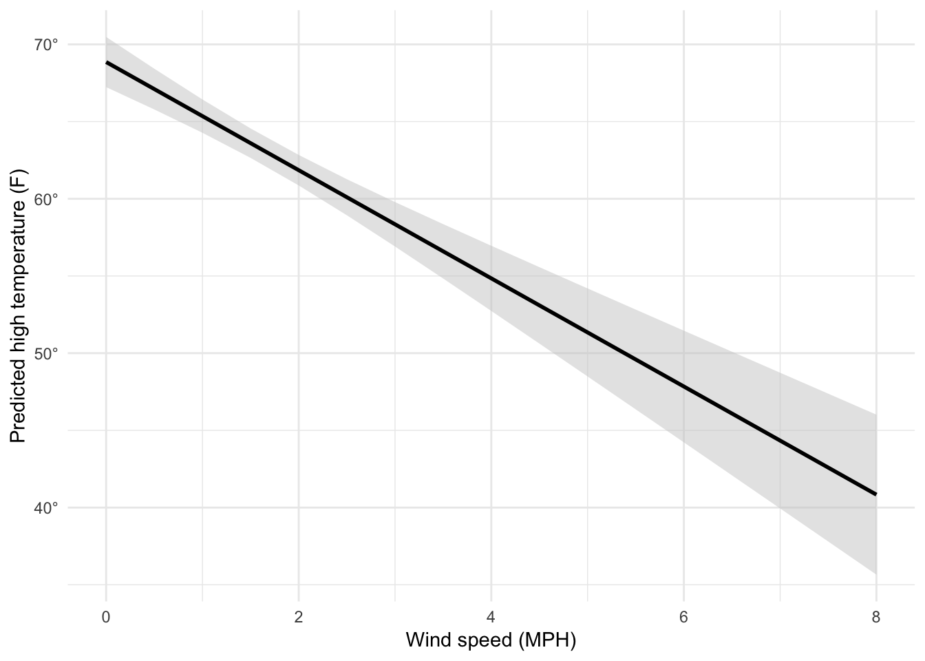
We can follow the same process to check the marginal effects of other variables, like cloud cover:
# Cloud cover
newdata_clouds <- data_frame(windSpeed = mean(weather_provo_2017_fixed$windSpeed),
                             pressure = mean(weather_provo_2017_fixed$pressure),
                             precipProbability_scaled = mean(weather_provo_2017_fixed$precipProbability_scaled),
                             moonPhase_scaled = mean(weather_provo_2017_fixed$moonPhase_scaled),
                             humidity_scaled = mean(weather_provo_2017_fixed$humidity_scaled),
                             cloudCover_scaled = seq(0, 100, by = 1))

# Calculate confidence intervals and scale cloud cover back down to 0-1 instead
# of 0-100 so we can use scale_x_continuous(labels = percent)
predicted_highs_clouds <- augment(model3, newdata = newdata_clouds) %>%
  mutate(conf.low = .fitted + (-1.96 * .se.fit),
         conf.high = .fitted + (1.96 * .se.fit)) %>%
  mutate(cloudCover = cloudCover_scaled / 100)

ggplot(predicted_highs_clouds, aes(x = cloudCover, y = .fitted)) +
  geom_ribbon(aes(ymin = conf.low, ymax = conf.high),
              fill = "grey80", alpha = 0.5) +
  geom_line(size = 1) +
  scale_x_continuous(labels = percent) +
  scale_y_continuous(labels = degree_format()) +
  labs(x = "Cloud cover", y = "Predicted high temperature (F)") +
  theme_minimal()
Super magic! These plots show the predicted high temperature across a range of possible cloud cover conditions (or wind speeds in the previous example), with all other explanatory variables held at their mean values.
Clearest and muddiest things
Go to this form and answer these two questions:
- What was the muddiest thing from class today? What are you still wondering about?
- What was the clearest thing from class today? What was the most exciting thing you learned?
I’ll compile the questions and send out answers after class.