Comparisons
Materials for class on Tuesday, October 23, 2018
Contents
Slides
Download the slides from today’s lecture.
Code to run today
Download the following files:
Code from today
Load libraries
library(tidyverse)
library(WDI)
library(scales)
library(ggrepel)
library(ggstance)
Get and clean data
World Bank Development Indicators
The World Bank has a ton of country-level data at data.worldbank.org. We can use a package named WDI to access their servers and download the data directly into R.
First, I create a list of indicators named indicators. The cryptic names from from the URLs of the different pages at the World Bank’s website. For instance, data for “school enrollment, primary” is available at https://data.worldbank.org/indicator/SE.PRM.NENR (I found that page by searching for primary school enrollment at data.worldbank.org). That last part of the URL (SE.PRM.NENR) is the magic ID code for the variable.
I then use the WDI() function to get those indicators from the World Bank. I want data from 1995-2015, so I set the start and end years accordingly. The extra=TRUE argument means that it’ll also include other helpful details like region, aid status, etc. Without it, it would only download the indicators we listed.
Then I clean up the data a little, filtering out rows that aren’t actually countries and renaming the ugly World Bank code columns to actual words.
Finally, I save this cleaned data as a CSV file so I don’t have to redownload this all every time I knit the document.
IMPORTANTLY, notice that there’s a chunk option on this chunk that says eval=FALSE. That means that R will not run this code when you knit it, but it will still include it in the document. That’s great. We have to run it here in RStudio to get the raw data and clean it up and write the CSV, but then we can just use the clean CSV file that we saved.
indicators <- c("SP.DYN.LE00.IN",  # Life expectancy
                "EG.ELC.ACCS.ZS",  # Access to electricity
                "SH.DYN.AIDS.ZS",  # HIV prevalence
                "EN.ATM.CO2E.PC",  # CO2 emissions
                "SI.POV.DDAY",     # Extreme poverty (% earning less than $2/day)
                "NY.GDP.PCAP.KD")  # GDP per capita

wdi_raw <- WDI(country = "all", indicators, extra = TRUE, start = 1995, end = 2015)

wdi_clean <- wdi_raw %>%
  filter(income != "Aggregates") %>%
  select(iso2c, country, year, life_expectancy = SP.DYN.LE00.IN,
         access_to_electricity = EG.ELC.ACCS.ZS, hiv_prevalence = SH.DYN.AIDS.ZS,
         co2_emissions = EN.ATM.CO2E.PC, pct_extreme_poverty = SI.POV.DDAY,
         gdp_per_cap = NY.GDP.PCAP.KD, region, income)

# We can save this as a CSV so we don't have to redownload it from the World
# Bank every time we run this
write_csv(wdi_clean, "data/wdi_clean.csv")
Because we didn’t evaluate the chunk above, we need to read the CSV file. If you want to be super fancy, you can set the chunk option include=FALSE, which will run this chunk but hide it from the output. That way, people think that you’re runing the code above (that uses WDI()), when really you’re just reading it from a CSV file. Tricky.
# Then we can just do this in the future
wdi_clean <- read_csv("data/wdi_clean.csv")
Democracy scores
We’ll also load democracy scores from the Polity IV project. This is a generally accepted way of measuring a country’s regime type. The scores range from -10 to 10 and fit within three categories:
- Autocracy: -10 to -6
- Anocracy: -5 to 5
- Democracy: 6 to 10
The scores are not tidy in this data, since there’s a column for each year, so we use gather() to make this dataset long.
dem_scores_raw <- read_csv("data/dem_scores.csv")

dem_scores <- dem_scores_raw %>%
  gather(year, score, -country)
Small multiples
Let’s look at trends in life expectancy in every country in the world!
# Only look at countries that have complete life expectancy data
life_expectancy <- wdi_clean %>%
  # Temporary filtering so we can work with just 6 countries at first
  # filter(country %in% c("Argentina", "Bolivia", "Brazil", "Belize", "Canada", "Chile")) %>%
  # Look at each country on its own and remove countries where any of the life
  # expectancy values are missing
  group_by(country) %>%
  filter(!any(is.na(life_expectancy)))

# See how many countries we're left with
life_expectancy %>% distinct(country)
## # A tibble: 195 x 1
## # Groups: country [195]
## country
## <chr>
## 1 United Arab Emirates
## 2 Afghanistan
## 3 Antigua and Barbuda
## 4 Albania
## 5 Armenia
## 6 Angola
## 7 Argentina
## 8 Austria
## 9 Australia
## 10 Aruba
## # ... with 185 more rows# Plot this stuff
big_plot <- ggplot(life_expectancy, aes(x = year, y = life_expectancy, color = region)) +
geom_line(size = 1) +
theme_void() +
guides(color = guide_legend(title = NULL)) +
theme(strip.text = element_text(face = "bold"),
legend.position = "bottom") +
facet_wrap(~ country, scales = "free_y")# Don't actually run big_plot here in RStudio because the plot panel is too
# small to handle all these countries. Instead, we can save the plot directly as
# a PDF or PNG with ggsave with giant dimensions
ggsave(big_plot, filename = "output/giant.pdf",
width = 20, height = 15, units = "in")
ggsave(big_plot, filename = "output/giant.png",
width = 20, height = 15, units = "in")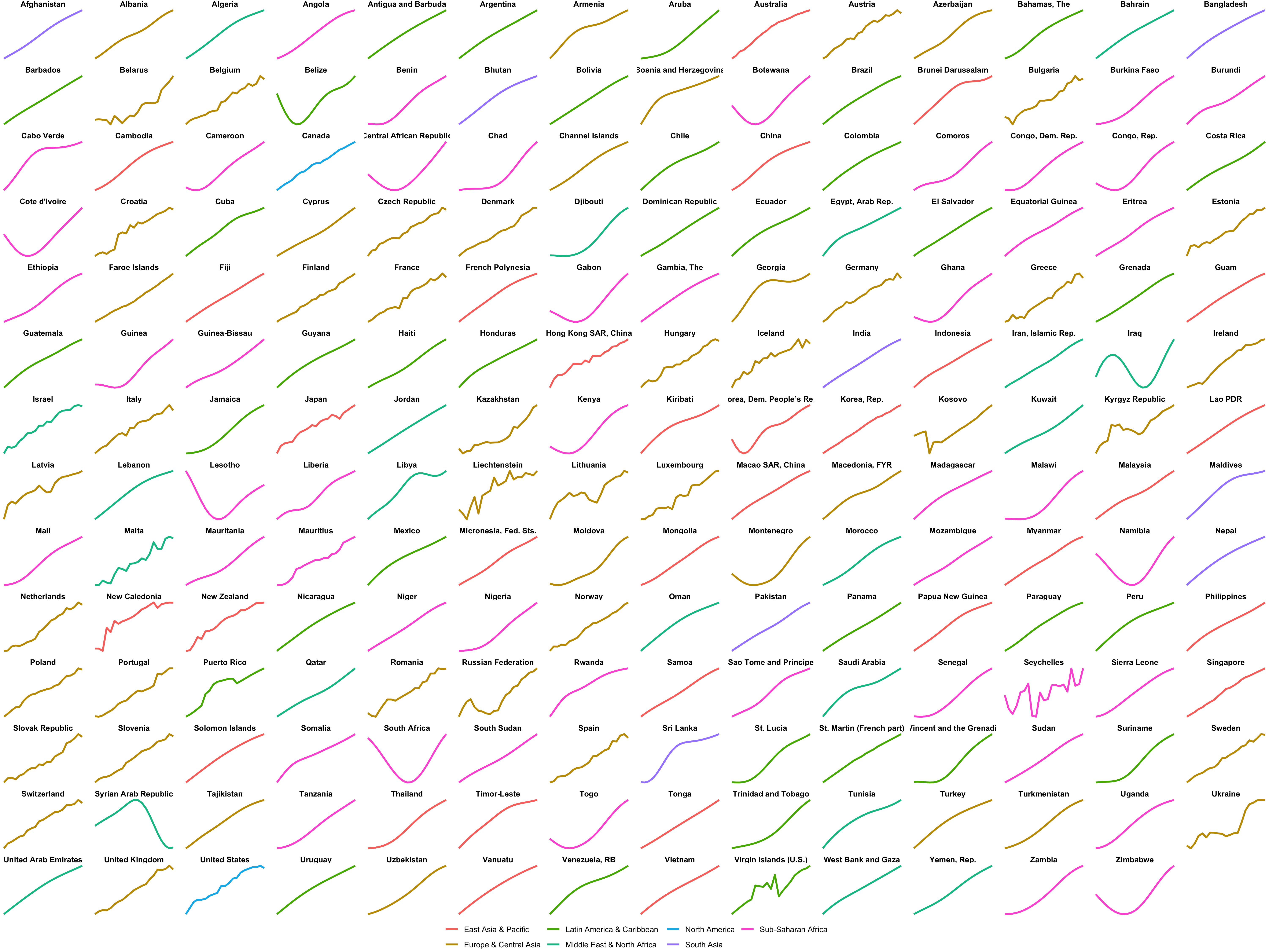
Small multiples
Slopegraphs
# Simple slopegraph with only a few countries
gdp_south_asia <- wdi_clean %>%
  filter(region == "South Asia") %>%
  filter(year %in% c(1995, 2015)) %>%
  group_by(country) %>%
  filter(!any(is.na(gdp_per_cap))) %>%
  ungroup() %>%
  mutate(year = factor(year)) %>%
  mutate(label_first = ifelse(year == 1995, paste0(country, " (", dollar(round(gdp_per_cap)), ")"), NA),
         label_last = ifelse(year == 2015, dollar(round(gdp_per_cap, 0)), NA))

# seed = 1234 (or any number) ensures that the random positioning is the same
# every time this plot is made
ggplot(gdp_south_asia, aes(x = year, y = gdp_per_cap, group = country, color = country)) +
  geom_line(size = 1.5) +
  geom_text_repel(aes(label = label_first), direction = "y", nudge_x = -1, seed = 1234) +
  geom_text_repel(aes(label = label_last), direction = "y", nudge_x = 1, seed = 1234) +
  guides(color = FALSE) +
  theme_void()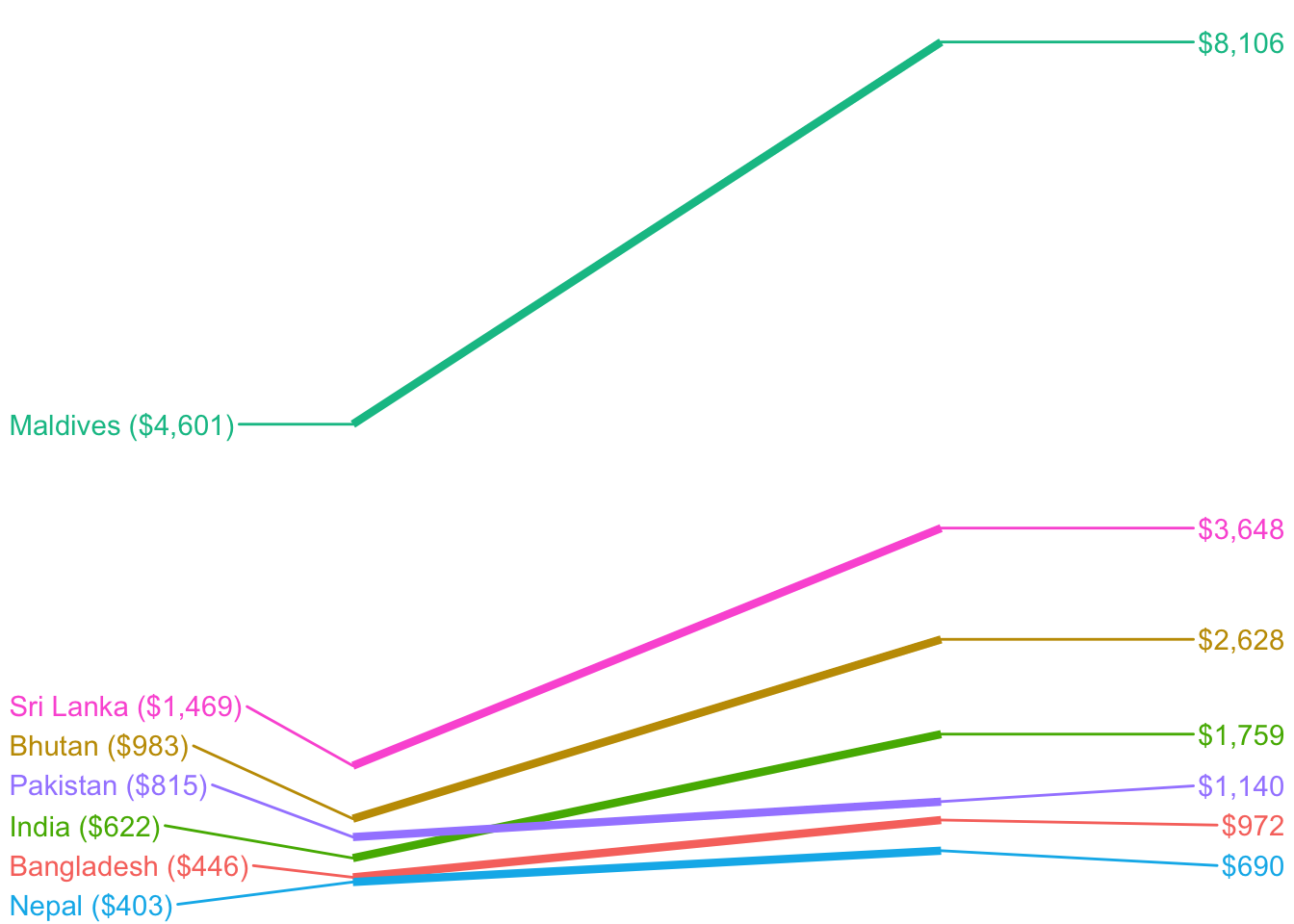
EVERYTHING. This looks so artsy.
gdp_everyone <- wdi_clean %>%
  filter(year %in% c(1995, 2015)) %>%
  group_by(country) %>%
  filter(!any(is.na(gdp_per_cap))) %>%
  ungroup() %>%
  mutate(year = factor(year))

ggplot(gdp_everyone, aes(x = year, y = gdp_per_cap, group = country)) +
  geom_line(size = 0.5, alpha = 0.25) +
  theme_void()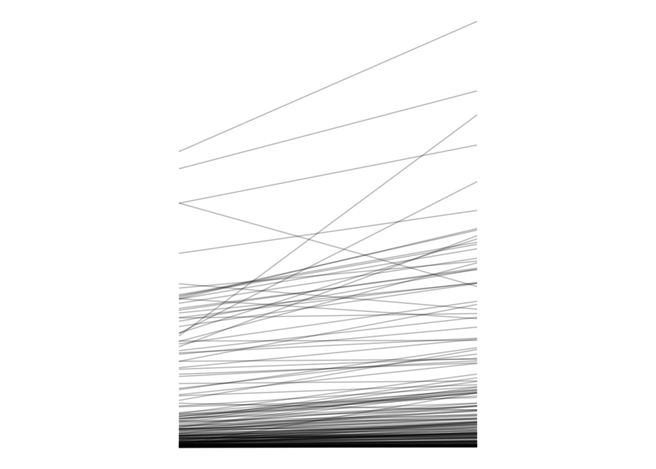
We can wrangle the data a little to determine which countries had the biggest change in GDP over the two decades.
# What country had that gigantic drop? Or rather, which countries had any drop?
gdp_everyone_changes <- gdp_everyone %>%
  select(country, year, gdp_per_cap) %>%
  spread(year, gdp_per_cap) %>%
  mutate(change = `2015` - `1995`,
         pct_change = (`2015` - `1995`) / `1995`) %>%
  arrange(change)
Democracy scores!
# Democracy scores
ggplot(dem_scores, aes(x = year, y = score, group = country)) +
  geom_line(alpha = 0.1) +
  geom_hline(yintercept = -5, color = "red") +
  geom_hline(yintercept = 5, color = "blue") +
  theme_minimal()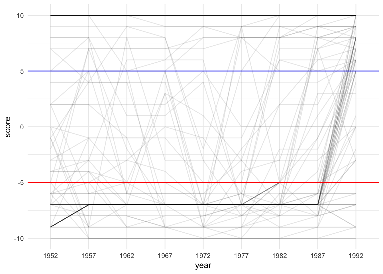
Sparklines
Sparklines are just line charts (or bar charts) that are really really small.
lithuania_democracy <- dem_scores %>%
  filter(country == "Lithuania")

plot_lith <- ggplot(lithuania_democracy, aes(x = year, y = score, group = country)) +
  geom_line() +
  theme_void()
plot_lith
bolivia_democracy <- dem_scores %>%
  filter(country == "Bolivia")

plot_bolivia <- ggplot(bolivia_democracy, aes(x = year, y = score, group = country)) +
  geom_line() +
  theme_void()
plot_bolivia
ggsave(plot_lith, filename = "output/lith_tiny.pdf",
       width = 1, height = 0.15, units = "in")
ggsave(plot_lith, filename = "output/lith_tiny.png",
       width = 1, height = 0.15, units = "in")

ggsave(plot_bolivia, filename = "output/bolivia_tiny.pdf",
       width = 1, height = 0.15, units = "in")
ggsave(plot_bolivia, filename = "output/bolivia_tiny.png",
       width = 1, height = 0.15, units = "in")
Once we export that as a PDF or PNG, we can use it in our document somewhere.
Lollipops
You’ve seen these already in your Lord of the Rings problem set, but here it is again. These are basically bar graphs, but with geom_pointrange(). We set ymin to 0 and ymax to the actual value in order to get the stem of the lollipop.
# Biggest percent changes in GDP per capita between 1995 and 2015
gdp_everyone_changes_top10 <- gdp_everyone_changes %>%
  arrange(desc(pct_change)) %>%
  slice(1:10) %>%  # This chooses rows 1 through 10
  mutate(country = fct_inorder(country))  # This makes sure the countries are sorted

ggplot(gdp_everyone_changes_top10, aes(x = fct_rev(country), y = pct_change)) +
  geom_pointrange(aes(ymin = 0, ymax = pct_change)) +
  coord_flip() +
  theme_minimal()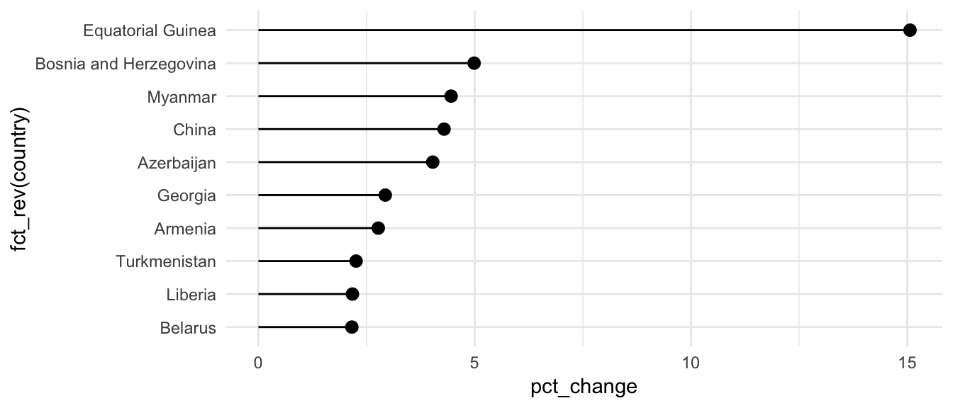
Alternatively, instead of using geom_pointrange() and coord_flip(), you can use geom_pointrangeh() from library(ggstance), which makes it so you don’t have to remember that the x and y axis are flipped
ggplot(gdp_everyone_changes_top10, aes(y = fct_rev(country), x = pct_change)) +
  geom_pointrangeh(aes(xmin = 0, xmax = pct_change)) +
  theme_minimal()
Bullet charts
Finally, we can use ggplot to make those goofy bullet chart things.
We can type the data in Excel and save as a CSV, or we can make a small data frame directly here in R with tribble(), which lets us define a data frame by row (hence the “r” in “tibble” here)
performance <- tribble(
  ~region, ~bad, ~satisfactory, ~good, ~target, ~value,
  "North", 33.3, 66.6,          100,   75,      70,
  "South", 33.3, 66.6,          100,   65,      72,
  "East",  33.3, 66.6,          100,   70,      78,
  "West",  33.3, 66.6,          100,   65,      71,
) %>%
  mutate(region = fct_inorder(region))

# Really all we do to get a bullet graph is overlay a bunch of columns
ggplot(performance, aes(x = fct_rev(region))) +
  geom_col(aes(y = good), fill = "#2c7fb8") +
  geom_col(aes(y = satisfactory), fill = "#7fcdbb") +
  geom_col(aes(y = bad), fill = "#edf8b1") +
  geom_col(aes(y = value), fill = "black", width = 0.4) +
  geom_errorbar(aes(ymin = target, ymax = target), color = "#f03b20", width = 0.75) +
  geom_point(aes(y = target), size = 3, color = "#f03b20") +
  labs(x = NULL, y = NULL) +
  coord_flip() +
  theme_minimal() +
  theme(panel.grid.minor = element_blank(),
        panel.grid.major = element_blank())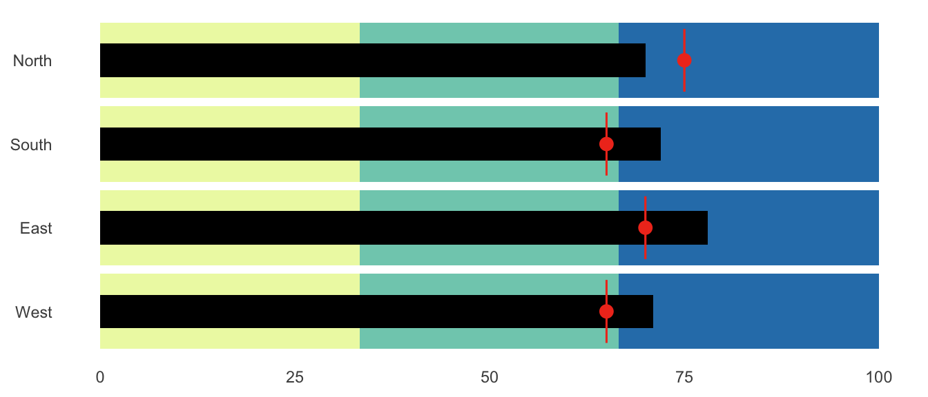
Clearest and muddiest things
Go to this form and answer these two questions:
- What was the muddiest thing from class today? What are you still wondering about?
- What was the clearest thing from class today? What was the most exciting thing you learned?
I’ll compile the questions and send out answers after class.