Time
Materials for class on Tuesday, October 30, 2018
Contents
Slides
Download the slides from today’s lecture.
Reproducible examples
Reprexes (or reproducible examples) are the best way to (1) get help online and (2) fix issues on your own.
Making a good reprex is tricky, but it’s a very valuable skill to know (regardless of programming language!). Here are some helpful resources for making them:
- What’s a reproducible example (
reprex) and how do I do one? - So you’ve been asked to make a reprex
- The reprex package
- Get help with the tidyverse
Style guide
Technically you can write your R code anyway you want. However, there are style conventions that make it easier to (1) read and remember what’s going on in your code, and (2) work with others in a project.
The tidyverse style guide is the most comprehensive style guide for R:It’s based on Google’s older R style guide, which was written before %>%s were a thing.
Live code
Use this link to see the code that I’m actually typing:
I’ve saved the R script to Dropbox, and that link goes to a live version of that file. Refresh or re-open the link as needed to copy/paste code I type up on the screen.
Code from today
Datapasta and tribbles and reprexes
In class we saw how to create a reprex (reproducible example) by using fake data. You can either type your data in Excel and paste it as code to generate a data frame in R using the datapasta addins, or you can subset your data like your_data_frame %>% slice(1:10) (to get the first 10 rows).
This whole chunk is completely reproducible and ready to be used as a question (here, it’s hypothetically asking how to get rid of the fill legend)
library(tidyverse)

fake_data <- tribble(
  ~animal, ~number,
  "cat", 1,
  "dog", 2,
  "bear", 3,
  "bison", 4
)

# This plot has a fill legend, but I want to remove it because it's reduntant.
# What's the best way to get rid of the fill?
ggplot(fake_data, aes(x = animal, y = number, fill = animal)) +
  geom_col()
  # I add something here, but what?
Interactivity
We also looked at how you can use paste() and paste0() to concatenate values and strings to make text that you can then plot.
library(plotly)  # For interactive plots

fake_data <- tribble(
  ~animal, ~number,
  "cat", 1,
  "dog", 2,
  "bear", 3,
  "bison", 4
) %>%
  mutate(cool_label = paste0("There are ", number, " ", animal, "s in the zoo."))

fake_data
## # A tibble: 4 x 3
## animal number cool_label
## <chr> <dbl> <chr>
## 1 cat 1 There are 1 cats in the zoo.
## 2 dog 2 There are 2 dogs in the zoo.
## 3 bear 3 There are 3 bears in the zoo.
## 4 bison 4 There are 4 bisons in the zoo.ugly_bar_plot <- ggplot(fake_data, aes(x = animal, y = number, fill = animal)) +
geom_col(aes(text = cool_label))
interactive_plot <- ugly_bar_plot %>%
ggplotly(tooltip = "text")
interactive_plot# This is like ggsave, but for interactive HTML plots
htmlwidgets::saveWidget(interactive_plot, "output/ugly_plot.html")Seeds
We also talked about setting a seed before doing anything with random numbers. This guarantees that the random number generating process will be the same every time.
This plot will be identical every time I run this (and it will be identical if you run it too). (This is also an example of the :: syntax—I haven’t loaded the scales library, but I can still format the x-axis as dollars by using scales::dollar())
set.seed(123)
fake_income <- data_frame(income = rnorm(1000, mean = 100000, sd = 25000))

ggplot(fake_income, aes(x = income)) +
  geom_density(fill = "#d834b5", color = NA) +
  labs(x = "Income", y = NULL) +
  scale_x_continuous(labels = scales::dollar) +
  theme(axis.text.y = element_blank(),
        axis.ticks.y = element_blank())
Custom themes
One really nice thing you can do is save all your theme customizations as an object. That way you can use it on any plot you want later on. You can set all these theme options by hand or use ggThemeAssist to generate them for you.
# I made this theme by tinkering with it attached to a ggplot object and making
# sure it looked okay (it's super ugly, but it's just an example). Then I moved
# it up here and assigned it to the `my_theme` object
my_theme <- theme_minimal() +
  theme(plot.title = element_text(face = "bold", size = rel(1.8)),
        plot.subtitle = element_text(face = "italic", size = rel(1.3), color = "grey50"),
        plot.caption = element_text(hjust = 0),
        # Move legend to the bottom of the plot
        legend.position = "bottom",
        # Move the legend to the left
        legend.justification = "left",
        # There's still a tiny gap between the edge of the plot and the legend,
        # so add some negative left margin to push it the rest of the way over.
        # Also add some negative top margin to bring it close to the plot
        legend.box.margin = margin(l = -0.75, t = -0.5, unit = "lines"),
        # Left align the x-axis title if there is one
        axis.title.x = element_text(hjust = 0))

# Here's one plot with the theme adjustments
ggplot(fake_data, aes(x = animal, y = number, fill = animal)) +
  geom_col() +
  labs(title = "This is the title",
       subtitle = "This is the subtitle",
       caption = "And this is the caption",
       x = NULL,
       y = "Count",
       fill = NULL) +
  my_theme
# Here's another plot with the same theme adjustments, plus removing the y axis
# (I didn't put that part in my_theme because I don't want all my plots to not
# have y axes)
ggplot(fake_income, aes(x = income)) +
  geom_density(fill = "#d834b5", color = NA) +
  labs(x = "Income", y = NULL, title = "Distribution of income",
       subtitle = "Totally fake data", caption = "Source: rnorm()") +
  scale_x_continuous(labels = scales::dollar) +
  my_theme +
  theme(axis.text.y = element_blank(),
        axis.ticks.y = element_blank(),
        panel.grid.major.y = element_blank(),
        panel.grid.minor.y = element_blank())
Super bonus theming stuff
I typically don’t assign my theme to an object, though. Instead, I create a function, which lets me (1) make adjustments like base_family or base_size, and (2) use a custom theme that looks like all the other layers in the ggplot chain (it really bugs me that my_theme doesn’t have parentheses while everything else does! :) )
Here are a bunch of real custom themes I’ve created:
theme_dv(): the theme I use for plots in this classtheme_donors(): the theme I use in a paper about aid agency donorstheme_ngo(): the theme I use in a paper on NGOs
This is how I typically make a custom theme. Notice that the function I make has two arguments: size and family. I pass these to theme_minimal() inside the function. That way I can run my_fancy_theme(size = 18) and then R will use theme_minimal(base_size = 18) inside the function.
my_fancy_theme <- function(size = 11, family = "") {
  final_theme <- theme_minimal(base_size = size, base_family = family) +
    theme(plot.title = element_text(face = "bold", size = rel(1.8)),
          plot.subtitle = element_text(face = "italic", size = rel(1.3), color = "grey50"),
          plot.caption = element_text(hjust = 0),
          legend.position = "bottom",
          legend.justification = "left",
          legend.box.margin = margin(l = -0.75, t = -0.5, unit = "lines"),
          axis.title.x = element_text(hjust = 0))

  return(final_theme)
}

ggplot(fake_data, aes(x = animal, y = number, fill = animal)) +
  geom_col() +
  labs(title = "This is the title", subtitle = "This is the subtitle",
       caption = "And this is the caption", x = NULL, y = "Count", fill = NULL) +
  my_fancy_theme(size = 15)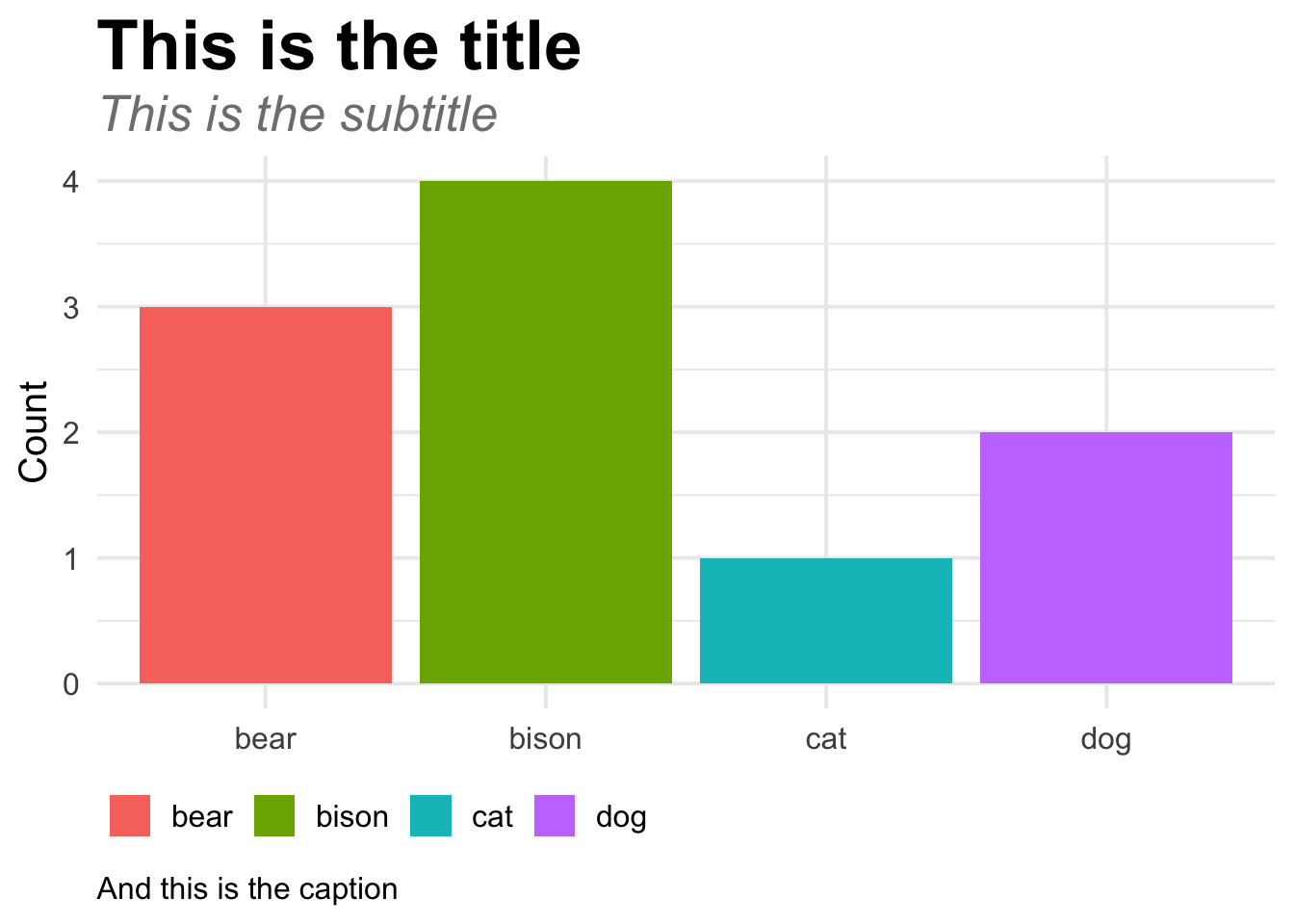
Forecasting and decomposition
We ran out of time for this in class, but really all I did was copy/paste from the examples and vignettes at these websites and adapt them to this births data from the CDC:
tibbletime- This whole series of tutorials on
tibbletime timetk- This tutorial on
sweep - Facebook’s Prophet library for forecasting
- Rob Hyndman’s Forecasting: Principles and Practice
I’m using these two datasets (from the CDC and fivethirtyeight)
Load libraries and data
# Libraries for time series and forecasting stuff
# You have to load *a ton* of these to get the ecosystem of time series packages working
library(lubridate)  # Deal with dates
library(tibbletime)  # Add cool time-based filtering functions
library(timetk)  # Convert data frames to time series-specific objects
library(forecast)  # Make forecasts and decompose time series
library(zoo)  # Another time series package
library(sweep)  # Convert forecasted objects into data frames (like broom, but for forecasts)
library(prophet)  # Facebook's Bayesian forecasting algorithm
I’m assuming these CSV files are in a folder in my project named “data”:
births_2000_2014 <- read_csv("data/US_births_2000-2014_SSA.csv")

# This data goes up to 2003, but the previous data starts at 2000, so we'll
# remove 2000-2003 from here
births_1994_1999 <- read_csv("data/US_births_1994-2003_CDC_NCHS.csv") %>%
  filter(year < 2000)
We need to manipulate this data a little after we combine these two datasets. Right now, there is a column for year, month, and day, but we need to make this an actual date, so we paste these numbers together with paste0(), and then use ymd() to parse the date as an actual date. The as_tbl_time() function at the end of the chain makes it so we can do cool filtering and summarizing and grouping with the time column in this data frame:
births_clean <- bind_rows(births_1994_1999, births_2000_2014) %>%
  mutate(date = paste0(year, "-", month, "-", date_of_month)) %>%
  mutate(date = ymd(date)) %>%
  select(date, births) %>%
  as_tbl_time(index = date)
Explore data
Since this data frame is time-enabled (with as_tbl_time), we can do cool things with it, like this:
# Only include rows from January 2000 to June 30, 2000
births_clean %>%
  filter_time("2000-01" ~ "2000-06-30")
## # A time tibble: 182 x 2
## # Index: date
## date births
## <date> <dbl>
## 1 2000-01-01 9083
## 2 2000-01-02 8006
## 3 2000-01-03 11363
## 4 2000-01-04 13032
## 5 2000-01-05 12558
## 6 2000-01-06 12466
## 7 2000-01-07 12516
## 8 2000-01-08 8934
## 9 2000-01-09 7949
## 10 2000-01-10 11668
## # ... with 172 more rows# Only include rows from 2010 to 2014, and then only select the first day of
# each month
births_clean %>%
filter_time("2010-01-01" ~ "2014-12-31") %>%
as_period("monthly", side = "start")## # A time tibble: 60 x 2
## # Index: date
## date births
## <date> <dbl>
## 1 2010-01-01 7871
## 2 2010-02-01 11445
## 3 2010-03-01 11984
## 4 2010-04-01 11994
## 5 2010-05-01 7911
## 6 2010-06-01 12591
## 7 2010-07-01 13181
## 8 2010-08-01 7370
## 9 2010-09-01 13409
## 10 2010-10-01 13141
## # ... with 50 more rowsLet’s create a month-based time series where we calculate the average number of births per month. Then we’ll plot it with a loess line:
births_monthly <- births_clean %>%
  collapse_by("monthly", side = "start") %>%
  group_by(date) %>%
  summarise(avg_births = mean(births))

ggplot(births_monthly, aes(x = date, y = avg_births)) +
  geom_line() +
  geom_smooth(method = "loess") +
  theme_minimal()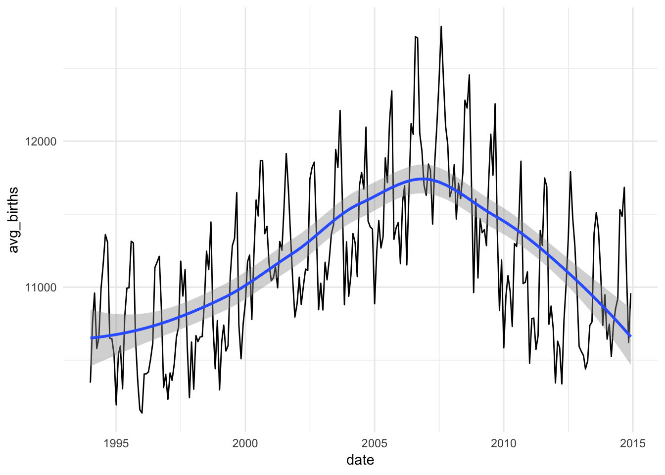
Neat!
We can also calculate a rolling average where we take the mean of every month’s previous twelve months. We use the rollify() function, which works a little strangely—it’s actually a function generator (meaning it’ll take some function, like mean, and make it work on the previous 12 periods).
# Here we define a bunch of rolling mean functions. These don't do anything
# yet—once you feed them some data, they'll calculate the mean of the past
# number of periods given in `window`
rolling_6 <- rollify(mean, window = 6)
rolling_12 <- rollify(mean, window = 12)
rolling_24 <- rollify(mean, window = 24)

births_monthly_with_means <- births_monthly %>%
  mutate(past_6 = rolling_6(avg_births),
         past_12 = rolling_12(avg_births),
         past_24 = rolling_24(avg_births))

# Make this long so we can plot all these rolling averages at the same time
births_monthly_long <- births_monthly_with_means %>%
  gather(window_size, value, c(past_6, past_12, past_24))

ggplot(births_monthly_long, aes(x = date, y = avg_births)) +
  geom_line(alpha = 0.25) +
  geom_line(aes(y = value, color = window_size), size = 0.75) +
  theme_minimal()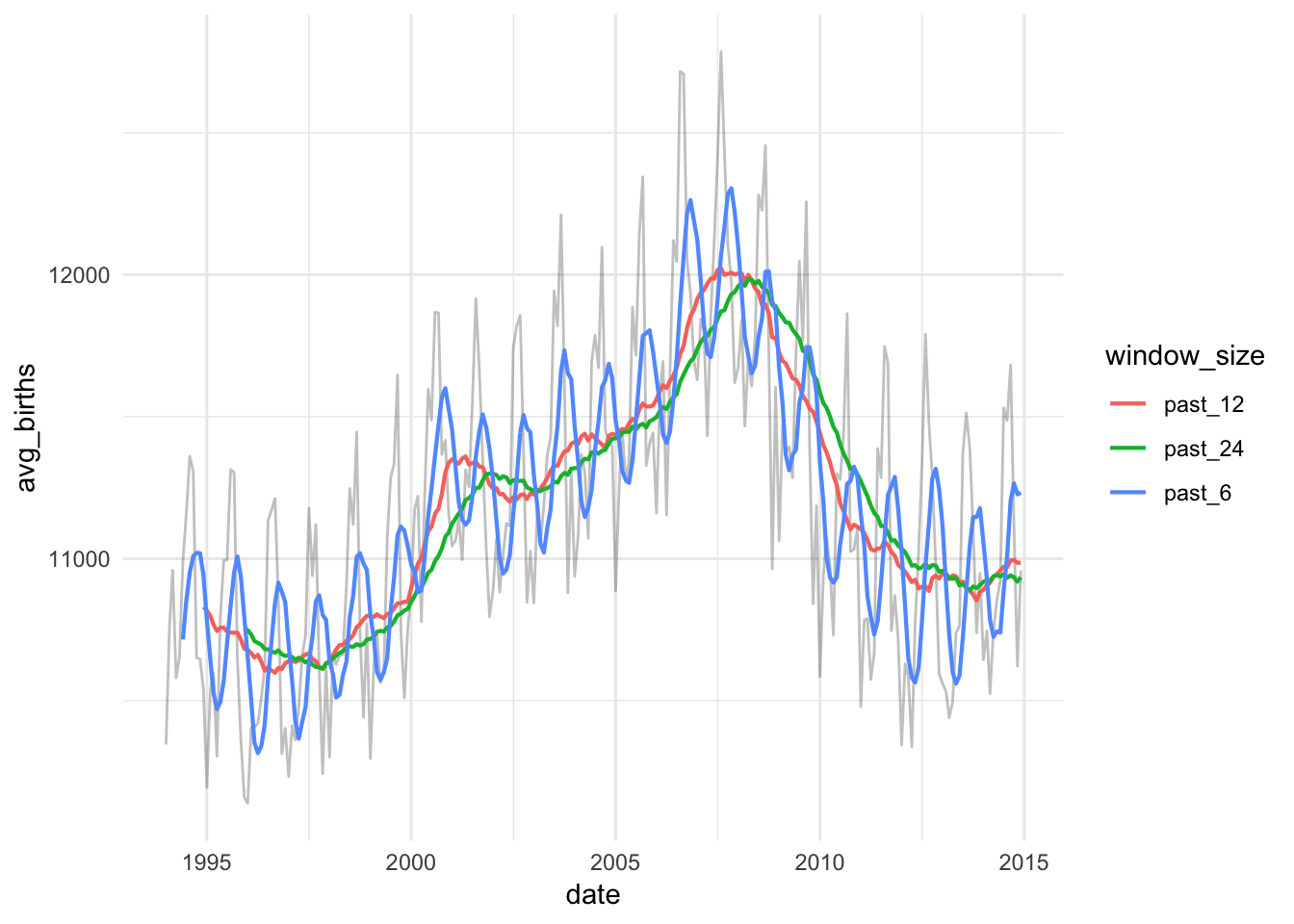
They’re all a little different! A 6-month window still shows some seasonality, while the 12- and 24-month windows are much smoother.
Decompose trends
We can decompose this time series and extract the trend and seasonality. But first, we have to convert our nice data frame into a strange time series-enabled object with the ts() function. To make life easier, we use the tk_ts() function here, which is part of the timetk package, which allows us to more easily convert our tidy data into time series data.
Here we add a new column that is time series-enabled:
births_months_ts <- births_monthly %>%
  mutate(births_ts = tk_ts(avg_births, start = c(1994, 1), frequency = 12))

# births_ts looks identical to avg_births, but it's not; it has metadata about
# periods and start dates and things like that
births_months_ts
## # A time tibble: 252 x 3
## # Index: date
## date avg_births births_ts
## <date> <dbl> <dbl>
## 1 1994-01-01 10345. 10345.
## 2 1994-02-01 10762. 10762.
## 3 1994-03-01 10959. 10959.
## 4 1994-04-01 10580. 10580.
## 5 1994-05-01 10655. 10655.
## 6 1994-06-01 10991. 10991.
## 7 1994-07-01 11157. 11157.
## 8 1994-08-01 11360. 11360.
## 9 1994-09-01 11307. 11307.
## 10 1994-10-01 10651. 10651.
## # ... with 242 more rowsNow we can decompose this with the stl() function (which stands for “seasonal, trend, and irregular, with loess”). s.window is set to periodic because the help file and every example I found online said to do that.
births_decomposed <- stl(births_months_ts$births_ts, s.window = "periodic")

# Look at the first few rows
head(births_decomposed$time.series)
## seasonal trend remainder
## Jan 1994 -451.9350 10944.27 -147.010706
## Feb 1994 -192.3067 10923.01 30.975569
## Mar 1994 -193.8057 10901.75 251.280333
## Apr 1994 -298.9887 10881.71 -2.987806
## May 1994 -151.4014 10861.67 -55.589677
## Jun 1994 131.7005 10842.76 16.775290Cool! It extracted the seasonal part, the trend part, and left us with some unexplained variation.
We can use autoplot() (which comes with the forecast library) to plot all of these at once.
# autoplot uses ggplot behind the scenes, so you can still add regular layers to
# it, like theme_minimal()
autoplot(births_decomposed) +
  theme_minimal()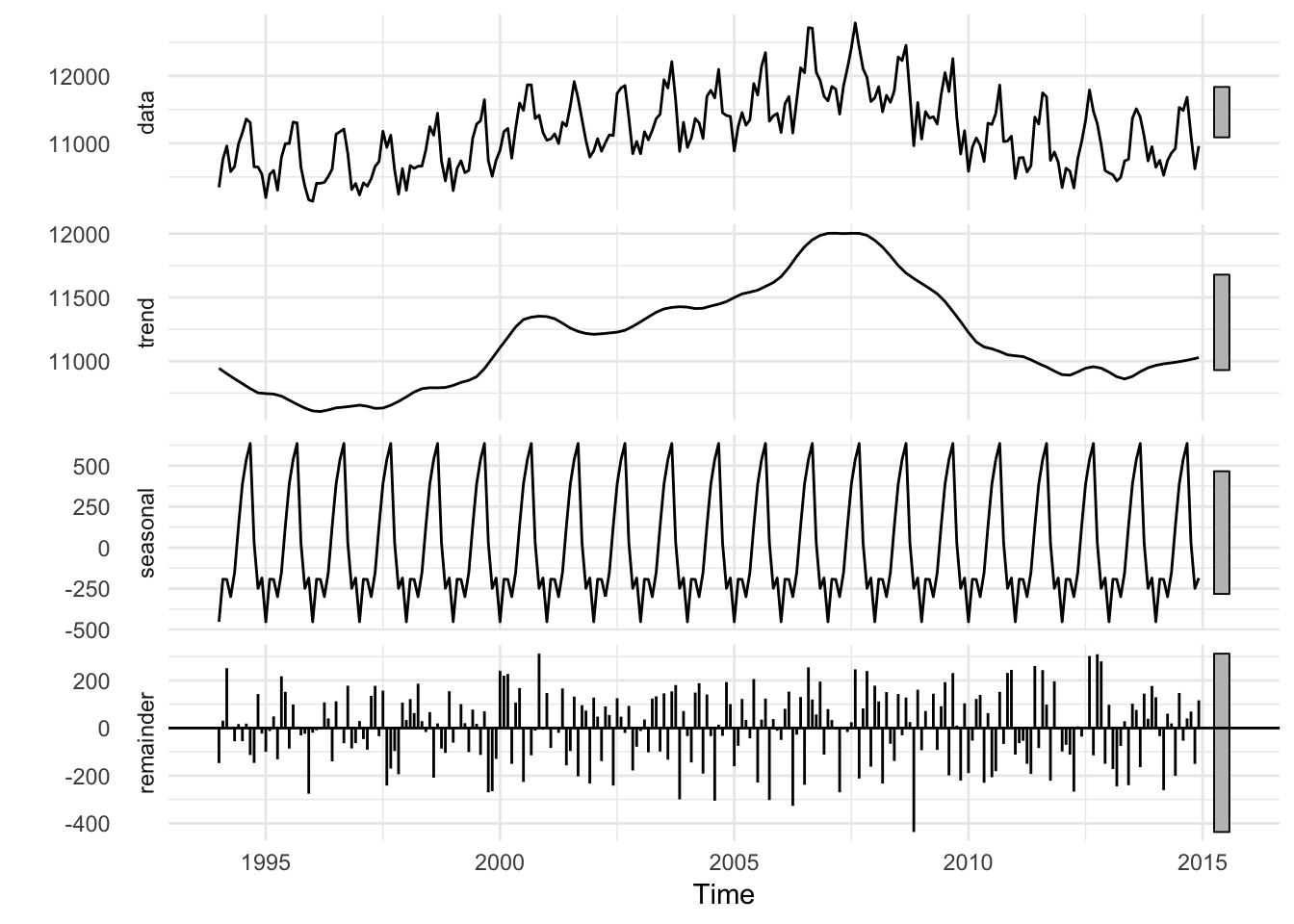
Or, we can extract each of these decomposed parts and plot them on our own (I prefer doing this, since I have more control over the data)
# You can extract each part of the decomposed time series with these functions
seasonal(births_decomposed)
trendcycle(births_decomposed)
remainder(births_decomposed)
# Or even better, do it all at once in a data frame
births_decomposed_nice <- births_decomposed$time.series %>%
tk_tbl() # Convert the weird time series object back to a data frame
# Combine the extracted parts with the original monthly data
births_with_decomposition <- births_monthly %>%
bind_cols(births_decomposed_nice)
# Yay!
births_with_decomposition## # A time tibble: 252 x 6
## # Index: date
## date avg_births index seasonal trend remainder
## <date> <dbl> <S3: yearmon> <dbl> <dbl> <dbl>
## 1 1994-01-01 10345. Jan 1994 -452. 10944. -147.
## 2 1994-02-01 10762. Feb 1994 -192. 10923. 31.0
## 3 1994-03-01 10959. Mar 1994 -194. 10902. 251.
## 4 1994-04-01 10580. Apr 1994 -299. 10882. -2.99
## 5 1994-05-01 10655. May 1994 -151. 10862. -55.6
## 6 1994-06-01 10991. Jun 1994 132. 10843. 16.8
## 7 1994-07-01 11157. Jul 1994 388. 10824. -55.1
## 8 1994-08-01 11360. Aug 1994 537. 10804. 18.7
## 9 1994-09-01 11307. Sep 1994 636. 10785. -113.
## 10 1994-10-01 10651. Oct 1994 28.9 10768. -146.
## # ... with 242 more rowsWe can make this data long, which will let us make facets for each of the parts:
births_decomposed_long <- births_with_decomposition %>%
  gather(variation_type, value, c(avg_births, seasonal, trend, remainder)) %>%
  mutate(variation_type = factor(variation_type,
                                 levels = c("avg_births", "trend", "seasonal", "remainder"),
                                 ordered = TRUE))

ggplot(births_decomposed_long, aes(x = date, y = value)) +
  geom_line() +
  theme_minimal() +
  facet_wrap(~ variation_type, ncol = 1, scales = "free_y")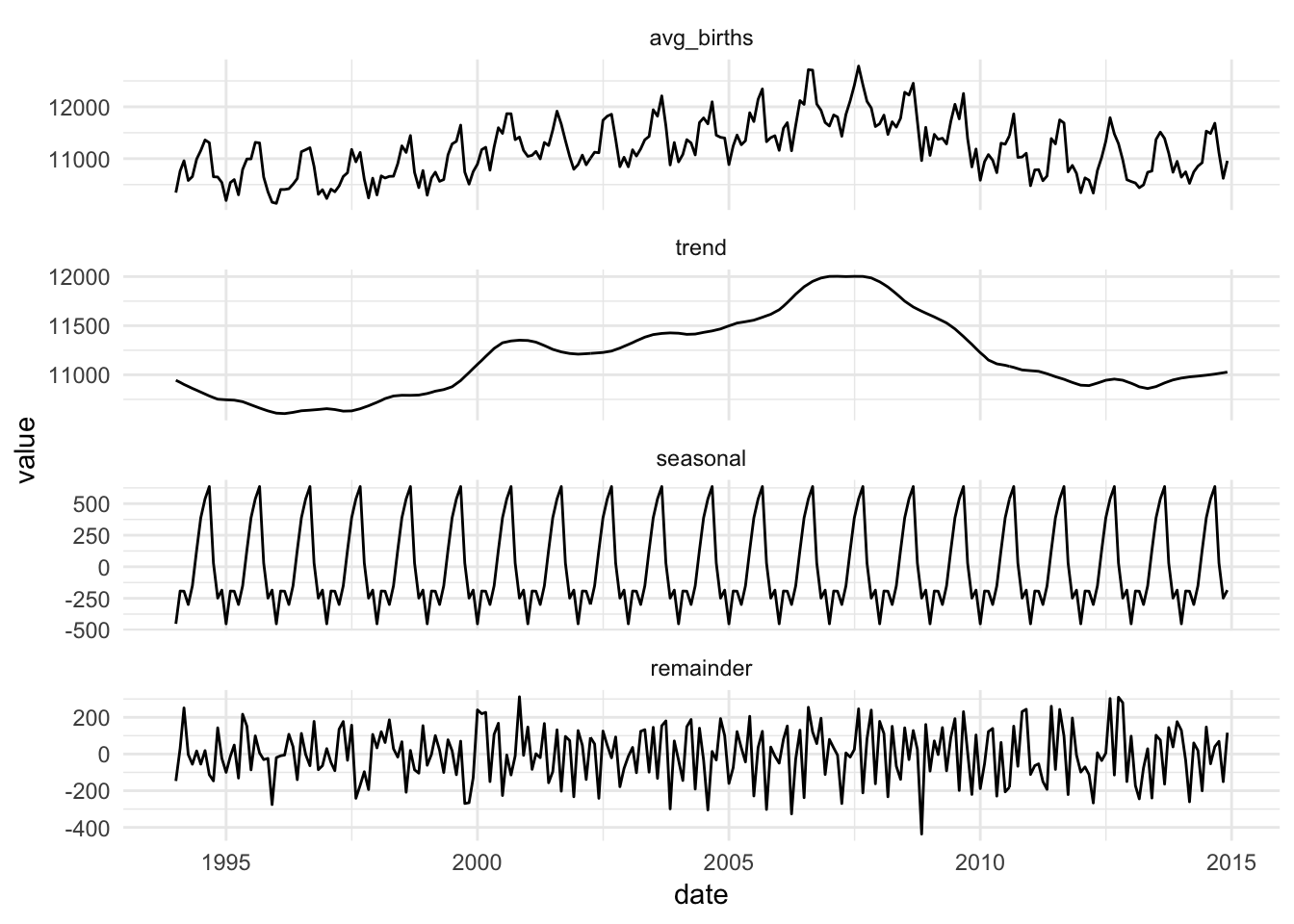
Super cool!
Forecasting
We can also use past trends and seasonality in the data to make predictions about the future using the forecast package. Here we use an auto ARIMA model to guess at the trend in the time series (there are a billion other ways to estimate this model—take Dr. Nelson’s forecasting class to learn those). Then we use that model to forecast a few periods into the future.
births_arima <- auto.arima(births_months_ts$births_ts)

# Use the model to forecast 12 months into the future
births_forecast <- forecast(births_arima, h = 12)

# Plot the forecast. Again, we can use autoplot.
autoplot(births_forecast) +
  theme_minimal()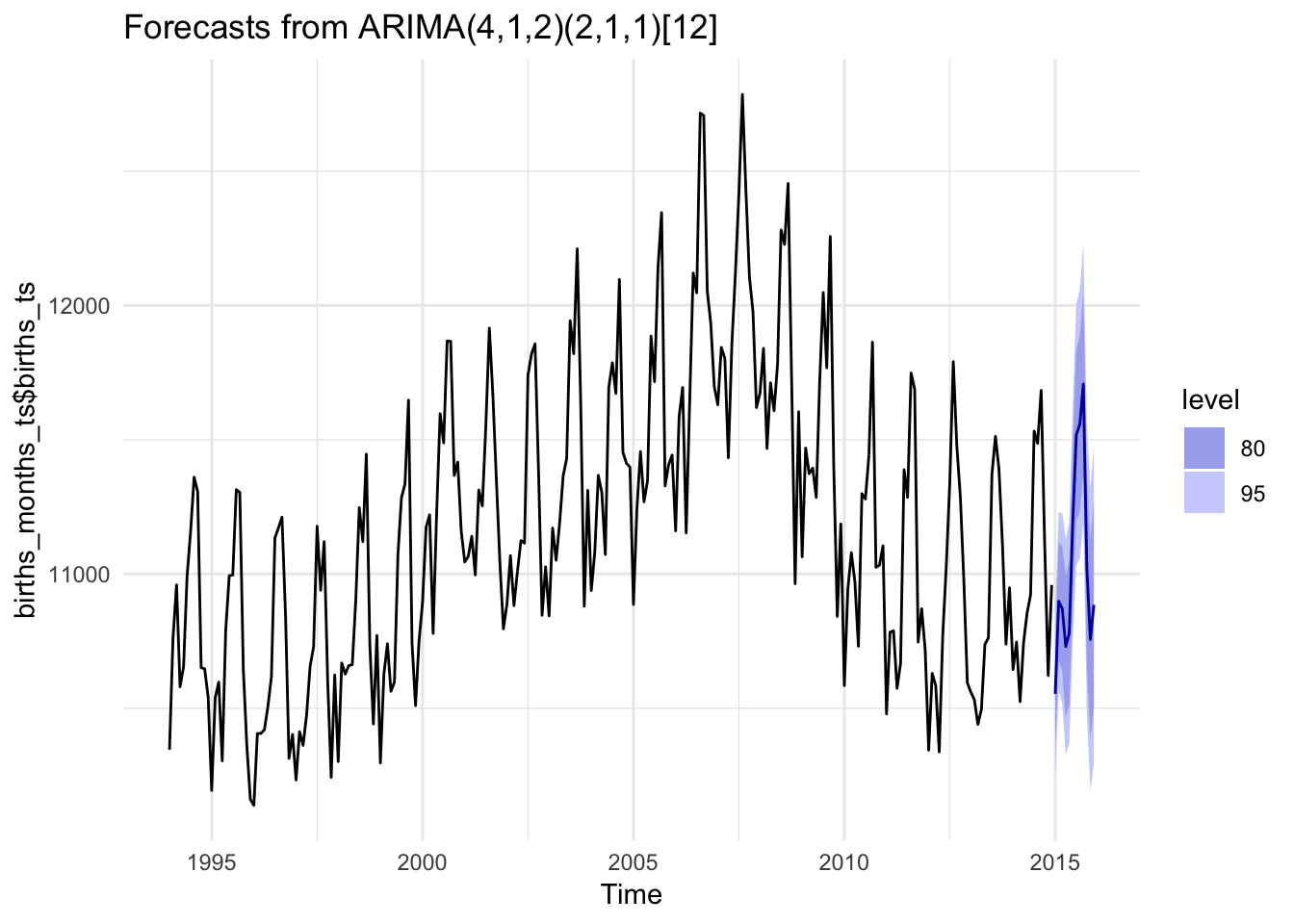
# We're fairly limited in what we can actually tweak when using autoplot(), so
# instead we can convert the forecast object to a data frame and use ggplot()
# like normal

# Get data out of this weird births_forecast object
births_forecast_tidy <- sw_sweep(births_forecast, timekit_idx = TRUE, rename_index = "date")
tail(births_forecast_tidy)  # Look at the last few rows of this forecast
## # A tibble: 6 x 7
## date key value lo.80 lo.95 hi.80 hi.95
## <S3: yearmon> <chr> <dbl> <dbl> <dbl> <dbl> <dbl>
## 1 Jul 2015 forecast 11518. 11200. 11032. 11835. 12003.
## 2 Aug 2015 forecast 11558. 11229. 11055. 11886. 12060.
## 3 Sep 2015 forecast 11707. 11370. 11191. 12045. 12223.
## 4 Oct 2015 forecast 11022. 10669. 10482. 11374. 11561.
## 5 Nov 2015 forecast 10756. 10387. 10191. 11125. 11320.
## 6 Dec 2015 forecast 10885. 10501. 10298. 11268. 11472.# For whatever reason, the date column here is a special type of variable called
# "yearmon", which ggplot doesn't know how to deal with (like, we can't zoom in
# on the plot with coord_cartesian). We use zoo::as.Date() to convert the
# yearmon variable into a regular date
births_forecast_tidy_real_date <- births_forecast_tidy %>%
mutate(actual_date = zoo::as.Date(date, frac = 1))
# Plot this puppy!
ggplot(births_forecast_tidy_real_date, aes(x = actual_date, y = value, color = key)) +
geom_ribbon(aes(ymin = lo.95, ymax = hi.95),
fill = "#3182bd", color = NA) +
geom_ribbon(aes(ymin = lo.80, ymax = hi.80, fill = key),
fill = "#deebf7", color = NA, alpha = 0.8) +
geom_line(size = 1) +
geom_point(size = 0.5) +
labs(x = NULL, y = "Births") +
scale_y_continuous(labels = scales::comma) +
# Zoom in on 2012-2016
coord_cartesian(xlim = ymd(c("2012-01-01", "2016-01-01"))) +
theme_minimal() +
theme(legend.position = "bottom")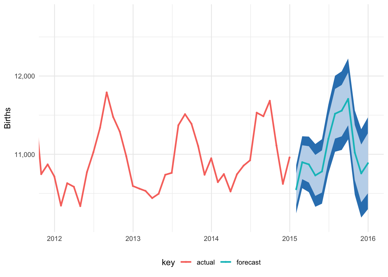
Magic!
Bayesian forecasting
Finally, we’ll use Facebook’s open source Bayesian forecasting algorithm to make a similar forecast. The prophet() function requires that the date column be named ds and the main outcome variable (here births) be named y. I don’t know why. So we rename those columns, feed the data frame through prophet(), then make an empty data frame for the future periods we’ll predict, and then use predict() to use the prophet model to make predictions for the empty future data frame.
births_prophetized <- births_monthly %>%
  select(ds = date, y = avg_births)

prophet_model <- prophet(births_prophetized)
## Disabling weekly seasonality. Run prophet with weekly.seasonality=TRUE to override this.## Disabling daily seasonality. Run prophet with daily.seasonality=TRUE to override this.## Initial log joint probability = -2.43379
## Optimization terminated normally:
## Convergence detected: relative gradient magnitude is below tolerancefuture_dates <- make_future_dataframe(prophet_model, periods = 36, freq = "month")
prophet_predict <- predict(prophet_model, future_dates)
# The plot() function for prophet objects uses ggplot behind the scenes, so we
# can add ggplot layers like normal
plot(prophet_model, prophet_predict) +
theme_minimal() +
# Zoom in on 2008-2018
# I only figured out this as.POSIXct thing because R was complaining when I
# did ymd() like I did above
coord_cartesian(xlim = as.POSIXct(c("2008-01-01", "2018-01-01")))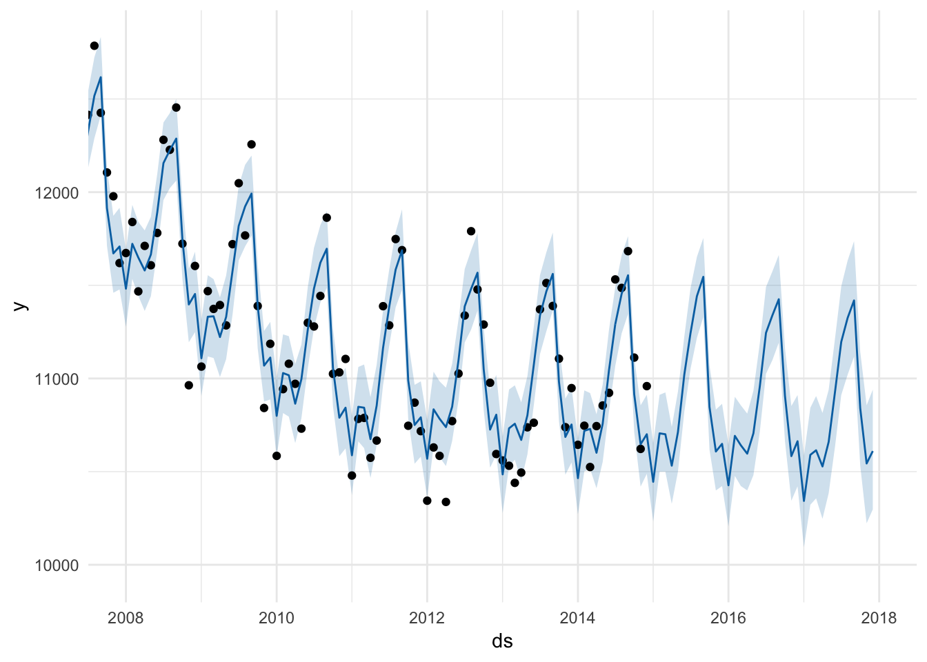
# We can also decompose this time series, but here we only get the yearly
# effects
#
# Even though both these plots are ggplot objects, for whatever reason we can't
# actually add additional layers like theme_minimal. Oh well.
#
# There's probably a way to extract each of these parts out like we did with the
# forecast library, but I don't want to dig around in the prophet documentation,
# so I won't ¯\_(ツ)_/¯
prophet_plot_components(prophet_model, prophet_predict) 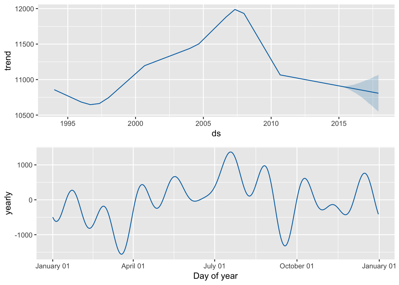
Clearest and muddiest things
Go to this form and answer these two questions:
- What was the muddiest thing from class today? What are you still wondering about?
- What was the clearest thing from class today? What was the most exciting thing you learned?
I’ll compile the questions and send out answers after class.