Annotating and grouping
Materials for class on Tuesday, November 27, 2018
Contents
Slides
Download the slides from today’s lecture.
Data to download
Download these and put them in a folder named “data” in an RStudio project:
- World happinessI collected this data from the UN and the World Bank. If you’re interested, you can see the R script I used to create this dataset here.
- Louisville animal bitesSee complete column descriptions. The data is released under a public domain license and hosted originally at Kaggle.
Live code
Use this link to see the code that I’m actually typing:
I’ve saved the R script to Dropbox, and that link goes to a live version of that file. Refresh or re-open the link as needed to copy/paste code I type up on the screen.
Louisville animal bites
Use some of this code to help you get started. You don’t have to do this—this gets a count of dog, cat, and other bites between 2010 and 2017. Feel free to do whatever you want. You’re iterating here!
library(tidyverse)
library(lubridate)

bites_raw <- read_csv("data/Health_AnimalBites.csv")

# Or directly from the internet if you want
# bites_raw <- read_csv("https://datavizf18.classes.andrewheiss.com/data/Health_AnimalBites.csv")

bites <- bites_raw %>%
  mutate(year = year(bite_date)) %>%
  mutate(species = case_when(
    SpeciesIDDesc == "CAT" ~ "Cat",
    SpeciesIDDesc == "DOG" ~ "Dog",
    TRUE ~ "Other"
  )) %>%
  mutate(species = factor(species, levels = c("Dog", "Cat", "Other"), ordered = TRUE)) %>%
  filter(year < 2018, year >= 2010)

bites_species_year <- bites %>%
  filter(!is.na(species)) %>%
  group_by(year, species) %>%
  summarize(total_bites = n())
Iterative design + grouping and annotating
Here are some fairly polished plots based on the world happiness index and other UN and World Bank data, all arranged in a nice 3-panel figure with patchwork. This is the final output—the process of getting to the point took a while and went through lots of different iterations, which is the creative process in action.
library(tidyverse)
library(ggrepel)
library(broom)  # For dealing with models as data frames
library(patchwork)
library(ggbeeswarm)  # For cool dot plots
happiness <- read_csv("data/world_happiness.csv")happiness_clean <- happiness %>%
mutate(in_asia = region == "East Asia & Pacific") %>%
mutate(label_to_plot = ifelse(in_asia, country, NA)) %>%
mutate(region_big = case_when(
region == "East Asia & Pacific" ~ "Asia",
region == "Europe & Central Asia" ~ "Europe",
region == "Latin America & Caribbean" ~ "North & South America",
region == "North America" ~ "North & South America",
region == "South Asia" ~ "Asia",
TRUE ~ region
)) %>%
mutate(region_big = factor(region_big,
levels = c("North & South America", "Europe",
"Middle East & North Africa", "Asia",
"Sub-Saharan Africa"),
ordered = TRUE))Happiness explained by life expectancy
Here’s the relationship between life expectancy and national happiness, with East Asian and Oceanic countries highlighted with redundant shapes. Note how instead of using annotate(), I make a separate data frame called extra_labels and then use geom_text() to plot it twice. This might be overkill here, since I’m only plotting two things, but it allows for more flexibility later if I want to add additional labels and not worry about adding even more annotate() layers.
extra_labels <- tribble(
  ~x, ~y, ~text, ~align,
  Inf, -Inf, "Longer life", "right",
  -Inf, Inf, "Happier country", "left"
)

plot1 <- ggplot(happiness_clean, aes(x = life_expectancy, y = happiness_score)) +
  geom_point(aes(color = in_asia, shape = in_asia)) +
  geom_label_repel(aes(label = label_to_plot), nudge_x = 1, nudge_y = 0.25, force = 50,
                   arrow = arrow(length = unit(0.25, "lines")), alpha = 0.75,
                   point.padding = 0.5, seed = 12345) +
  geom_text(data = filter(extra_labels, align == "right"),
            aes(x = x, y = y, label = text),
            hjust = "right", vjust = -1, color = "grey50", fontface = "italic") +
  geom_text(data = filter(extra_labels, align == "left"),
            aes(x = x, y = y, label = text),
            hjust = "left", vjust = 1, color = "grey50", fontface = "italic") +
  # annotate(geom = "text", x = 70, y = 5, label = "HEY", fontface = "bold", size = 15) +
  labs(x = "Life expectancy (years)", y = "Happiness score",
       title = "Relationship between life expectancy and national happiness",
       subtitle = "East Asia and Oceania highlighted") +
  scale_color_manual(values = c("grey40", "darkred")) +
  guides(color = FALSE, shape = FALSE) +
  theme_minimal(base_size = 13) +
  theme(panel.grid.minor = element_blank(),
        plot.title = element_text(face = "bold", size = rel(1.5)),
        plot.subtitle = element_text(margin = margin(b = 20)))
plot1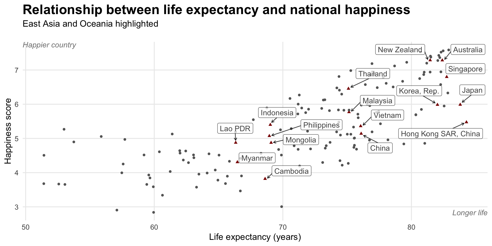
Happiness explained by life expectancy, colored by region
Here I collapsed some of the regions with case_when() up above, and then generated a palette of five perceptually uniform and colorblind friendly colors at iWantHue.
The other cool thing about this plot is final_predicted_points, which runs a linear regression model on each region and then determines the final predicted point for each line, which I then use with geom_text_repel() to put region names directly on the plot.
final_predicted_points <- happiness_clean %>%
  # Look at each region
  group_by(region_big) %>%
  # Put a miniature data frame inside a cell for each region
  nest() %>%
  # Run a simple regression model on each of those nested data frames
  mutate(model = data %>% map(~ lm(happiness_score ~ life_expectancy, data = .))) %>%
  # Use augment() to calculate the fitted values from each model
  mutate(fitted = model %>% map(~ augment(.))) %>%
  # Spread out the nested data frame
  unnest(fitted) %>%
  # Select the first row in each of the fitted values, which is the last row
  group_by(region_big) %>%
  arrange(desc(life_expectancy)) %>%
  slice(1)

plot2 <- ggplot(happiness_clean,
                aes(x = life_expectancy, y = happiness_score, color = region_big)) +
  geom_point(aes(shape = region_big)) +
  geom_smooth(method = "lm", se = FALSE) +
  geom_text_repel(data = final_predicted_points,
                  aes(x = life_expectancy, y = .fitted, label = region_big),
                  nudge_x = 5, direction = "y", hjust = "left", size = 4) +
  scale_x_continuous(breaks = seq(50, 80, 10)) +
  scale_color_manual(values = c("#b84c7d", "#56ae6c", "#7f63b8", "#ac9c3d", "#ba543d")) +
  scale_shape_manual(values = c(19, 17, 16, 15, 8)) +
  coord_cartesian(xlim = c(50, 100)) +
  guides(color = FALSE, shape = FALSE) +
  labs(x = "Life expectancy (years)", y = "Happiness score",
       title = "Trends in life expectancy by region") +
  theme_minimal(13) +
  theme(panel.grid.minor = element_blank(),
        plot.title = element_text(face = "bold", size = rel(1.5)))
plot2
Happiness by region
Here I just plot happiness scores (i.e. no comparison with life expectancy or anything else) by region. I use geom_quasirandom() from the ggbeeswarm package, which jitters points in cool shapes.
plot3 <- ggplot(happiness_clean,
                aes(x = fct_rev(region_big), y = happiness_score, color = region_big)) +
  geom_quasirandom(aes(shape = region_big), width = 0.2) +
  scale_color_manual(values = c("#b84c7d", "#56ae6c", "#7f63b8", "#ac9c3d", "#ba543d")) +
  scale_shape_manual(values = c(19, 17, 16, 15, 8)) +
  guides(color = FALSE, shape = FALSE) +
  labs(x = NULL, y = "Happiness score", title = "Happiness scores by region") +
  coord_flip() +
  theme_minimal(13) +
  theme(panel.grid.minor = element_blank(),
        panel.grid.major.y = element_blank(),
        plot.title = element_text(face = "bold", size = rel(1.5)))
plot3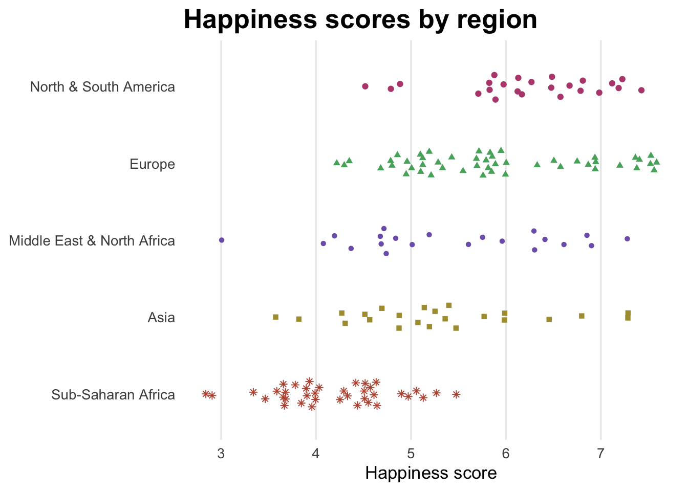
Combined mega plot with patchwork
Finally, I put all of these together in a final combined plot using the patchwork package.
Note how I make some adjustments to plot1, plot2, and plot2, like shrinking the titles and adding tags. Also note that I use / and + and * and & to combine the plots in the right configuration. I figured this out by reading the README at patchwork’s GitHub repository.
plot1_to_combine <- plot1 +
  labs(tag = "A")

plot2_to_combine <- plot2 +
  labs(tag = "B")

plot3_to_combine <- plot3 +
  labs(tag = "C")

final_plot <- plot1_to_combine /
  ((plot2_to_combine + plot3_to_combine) + plot_layout(widths = c(0.7, 0.3))) &
  theme(plot.title = element_text(size = rel(1)),
        plot.subtitle = element_text(size = rel(0.9)),
        plot.tag = element_text(color = "grey50"),
        axis.title.x = element_text(hjust = 0))
final_plot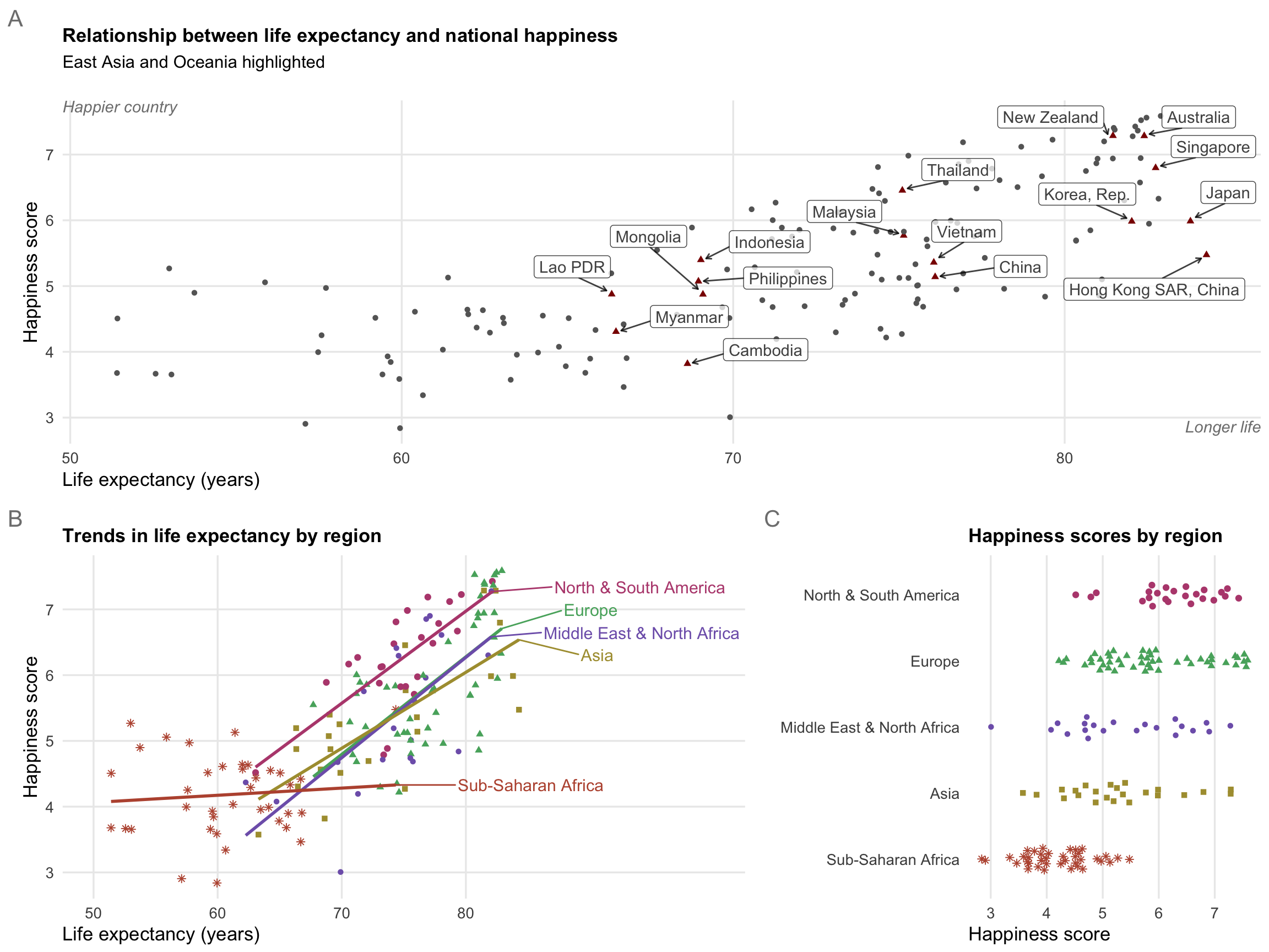
Clearest and muddiest things
Go to this form and answer these two questions:
- What was the muddiest thing from class today? What are you still wondering about?
- What was the clearest thing from class today? What was the most exciting thing you learned?
I’ll compile the questions and send out answers after class.