Proportions
Readings due before class on Tuesday, October 2, 2018
Required
- Chapter 10 in Claus Wilke, Fundamentals of Data VisualizationClaus E. Wilke, Fundamentals of Data Visualization (Sebastopol, California: O’Reilly Media, 2018), https://serialmentor.com/dataviz/.
- Engaging Readers with Square Pie/Waffle Charts
- Understanding Pie Charts
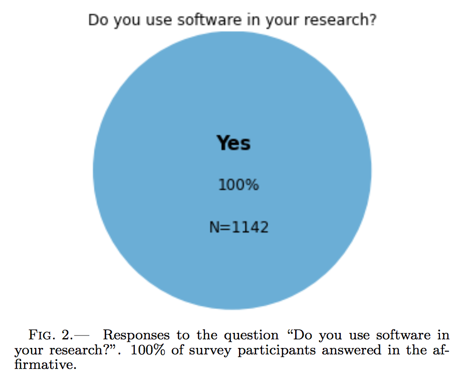
 Figure 2 from Ivelina Momcheva and Erik Tollerud, “Software Use in Astronomy: An Informal Survey,” July 14, 2015, https://arxiv.org/abs/1507.03989.
- Square pie chart beats out the rest in perception study
Recommended
- Ian Spence, “No Humble Pie: The Origins and Usage of a Statistical Chart”Ian Spence, “No Humble Pie: The Origins and Usage of a Statistical Chart,” Journal of Educational and Behavioral Statistics 30, nos. 4, Winter (2005): 353–68, doi:10.3102/10769986030004353.
- Jeffrey Heer and Michael Bostock, “Crowdsourcing Graphical Perception: Using Mechanical Turk to Assess Visualization Design”Jeffrey Heer and Michael Bostock, “Crowdsourcing Graphical Perception: Using Mechanical Turk to Assess Visualization Design,” in ACM Human Factors in Computing Systems, 2010, 203–12, doi:10.1145/1753326.1753357.
Questions to reflect on
- How do these types of visualizations help or hinder or search for truth in data?
- What’s the best way to visualize proportional data?
- What did you think about pie charts before this class? What do you think about them now? What do you think about Claus Wilke’s ecumenical approach to them?