Problem set 4
Due by 11:59 PM on Tuesday, October 30, 2018
Task 0: Setting things up
Create a new RStudio project somewhere on your computer. Open that new folder in Windows File Explorer or macOS Finder (however you navigate around the files on your computer), and create subfolders there named output and data.
Download this R Markdown file and place it in the root of your newly-created projectYou’ll probably have to right click on the link and choose “Save link as…”.
It contains an basic outline/skeleton of the tasks you’ll do in this assignment. It doesn’t have a lot this time. You’re on your own.
Download these two CSV files and place them in your data folder:
In the end, the structure of your new project directory should look something like this:
your-project-name/
  your-name_problem-set-4.Rmd
  your-project-name.Rproj
  output/
    NOTHING
  data/
    unemployment.csv
    water_usage.csv
Task 1: Bullet charts
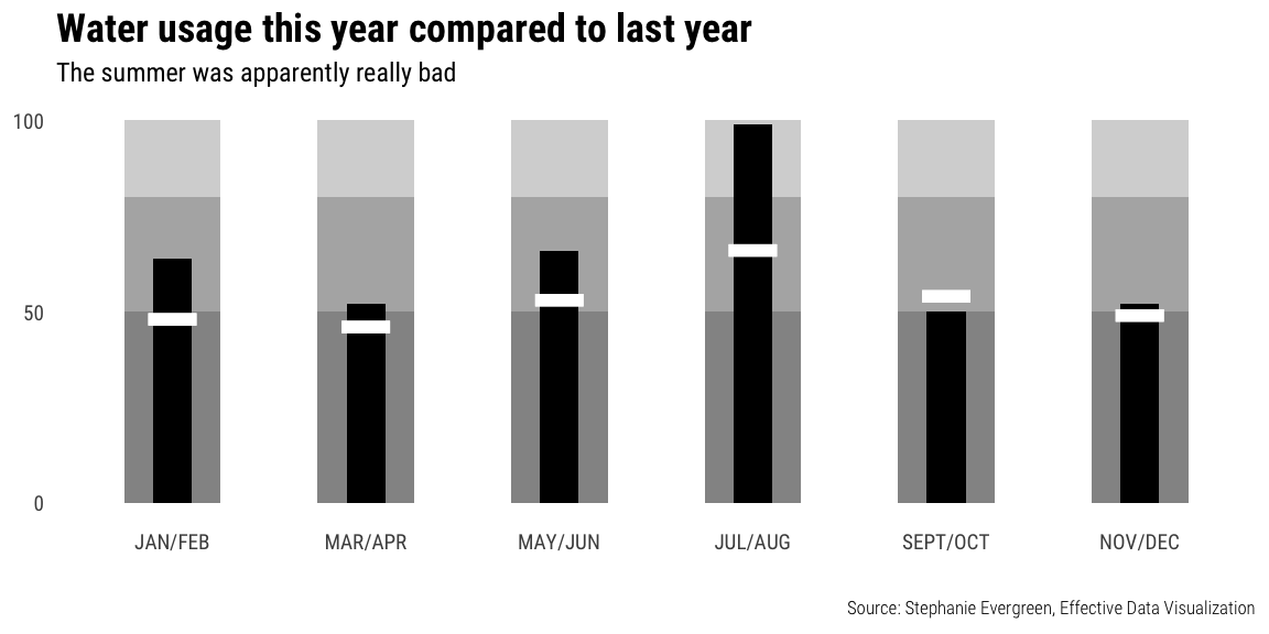
Bullet charts are goofy and wonky, but they’re excellent practice problems for ggplot, since they involve lots of geom_*() layers.
Recreate this figure in R.Original figure by Bill Dean, posted at “The Bullet Graph”.
Don’t worry about including the legend.
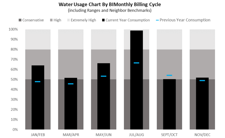
Bill Dean’s bullet chart
A couple hints:
- You can see general code for bullet charts in R here
- You’ll need to make the months an ordered factor, otherwise they’ll plot alphabetically. Use
fct_inorder().
The final image should look something like this: Don’t worry about custom fonts unless you want to be brave; I’m using Roboto Condensed in the plot.
You can use whatever colors you want and whatever titles you want.
Task 2: Small multiples
Use data from the US Bureau of Labor Statistics (BLS) to show the trends in employment rate for all 50 states between 2006 and 2016. What stories does this plot tell? Which states struggled to recover from the 2008–09 recession?
Some hints:
- You can see general code for these giant small multiple plots from class. You won’t need to filter out any missing rows because the data here is complete—there are no state-year combinations with missing unemployment data.
- This plot will show 51 states at a time instead of nearly 200 countries like in class, so RStudio’s viewer can manage it—you won’t need to save the plot to a gigantic PDF like we did in class.
- Plot the
datecolumn along the x-axis, not theyearcolumn. If you plot by year, you’ll get weird looking lines (try it for fun?), since these observations are monthly. If you really want to plot by year only, you’ll need to create a different data frame where you group by year and state and calculate the average unemployment rate for each year/state combination (i.e.group_by(year, state) %>% summarize(avg_unemployment = mean(unemployment)))
Task 3: Slopegraphs
Use data from the BLS to create a slopegraph that compares the unemployment rate in January 2006 with the unemployment rate in January 2009, either for all 50 states at once or for a specific region or division. Make sure the plot doesn’t look too busy or crowded in the end.
What story does this plot tell? Which states in the US (or in the specific region you selected) were the most/least affected the Great Recession?
Some hints:
- You can see general code for these slopegraphs in the example from class
- You should use
filter()to only select rows where the year is 2006 or 2009 (i.e.filter(year %in% c(2006, 2009)) and to select rows where the month is January (filter(month == 1)orfilter(month_name == "January")) - In order for the year to be plotted as separate categories on the x-axis, it needs to be a factor, so use
mutate(year = factor(year))to convert it. - To make ggplot draw lines between the 2006 and 2009 categories, you need to include
group = statein the aesthetics - When telling your story, it might be helpful to highlight specific states with a different color. The easiest way to do this is to create a new variable called “highlight” or “emphasize” or whatever you want to call it that is either TRUE or FALSE. Then map that variable to color in the aesthetics. For instance, if I wanted to highlight just Utah and Arizona, I would do something like this (this isn’t a slopegraph, but the concept is the same):
unemployment_with_highlights <- unemployment %>%
  mutate(highlight = ifelse(state %in% c("Utah", "Arizona"), TRUE, FALSE))

ggplot(unemployment_with_highlights,
       aes(x = date, y = unemployment, group = state, color = highlight)) +
  geom_line(size = 0.5, alpha = 0.75) +
  scale_color_manual(values = c("grey70", "red"), guide = FALSE) +
  theme_minimal()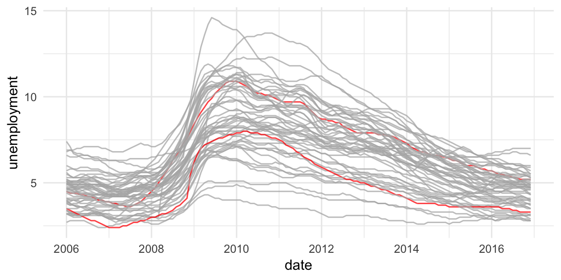
Submit
When you’re done, submit a knitted PDF or Word file of your analysis on Learning Suite. As always, it’s best if the final knitted document is clean and free of warnings and messages (so if a chunk is creating messages, like wherever you run library(tidyverse), add message=FALSE, warning=FALSE to the chunk options).
Postscript: how I got this unemployment data
For the curious, here’s the code I used to download the unemployment data from the BLS.
And to pull the curtain back and show how much googling is involved in data visualization (and data analysis and programming in general), here was my process for getting this data:
- I thought “I want to have students show variation in something domestic over time” and then I googled “us data by state”. Nothing really came up (since it was an exceedingly vague search in the first place), but some results mentioned unemployment rates, so I figured that could be cool.
- I googled “unemployment statistics by state over time” and found that the BLS keeps statistics on this. I clicked on the “Data Tools” link in their main navigation bar, clicked on “Unemployment”, and then clicked on the “Multi-screen data search” button for the Local Area Unemployment Statistics (LAUS).
- I walked through the multiple screens and got excited that I’d be able to download all unemployment stats for all states for a ton of years, BUT THEN the final page had links to 51 individual Excel files, which was dumb.
- So I went back to Google and searched for “download bls data r” and found a few different packages people have written to do this. The first one I clicked on was
blscrapeRat GitHub, and it looked like it had been updated recently, so I went with it. - I followed the examples in the
blscrapeRpackage and downloaded data for every state.
Another day in the life of doing modern data science. I had no idea people had written R packages to access BLS data, but there are like 3 packages out there! After a few minutes of tinkering, I got it working and it’s super magic.